It's extremely hot here. After our chilly big 40th party a few weeks ago, the weather has (naturally) warmed up to the oven-like temperatures that we usually experience in an Adelaide Summer. This weekend we've spent it either in the cool of the house, trapped by the air-conditioning… or in the pool. It's been 40C both days.
![]()
Mr AV and I went out to dinner together to From Orient in the city. I wore this navy Tory Burch shift dress, which has a sparkly neckline so negating any further accessorises. Easy dressing. Food was delicious, service was lacking.
![]()
I've spent the rest of the weekend doing all sorts of odd jobs. I've finally got around to writing out the 22 thank you cards that I owe for all the presents we were given by our friends for our 40th party. I don't mind writing a thank you card or two occasionally, but it always makes me realise how little handwriting we now do. When writing things en masse like this I find my hand cramps up, and there are the frequent spelling mistakes that occur when there's no auto spell check (I am terrible at spelling, much to my late Mother's chagrin. She was a High School English Teacher once upon a time). There were a few things that were nice about this task - I love using nice stationary, I had some very nice Open Garden Australia stamps, and I always feel a great sense of satisfaction when I've finished and I get to stamp our address on the back of all the envelopes. This is one of my favourite things - the address stamp. I ordered it when we moved into the house from an etsy seller, and it saves a lot of time when I've got a few letters or cards to send out. The stamps make for a good housewarming present too.
![]()
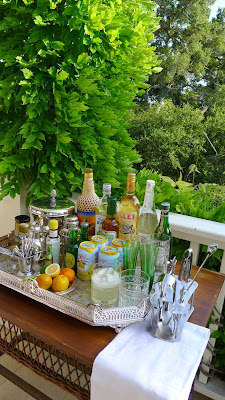
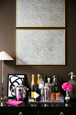
This also lead to me deciding to clean all my silver, as I was staring at a tarnished pen pot during most of the writing. Now the Christening mug/ pen pot is all sparkly, plus the toast/ letter rack, letter opener and my tea strainer and various pieces of cutlery and salt and pepper pots. I was also prompted to clean the silver by the fact that I went to Costco on Friday morning and bought a 6KG bag of Baking Soda. So handy for all my cleaning jobs! I like to put a mixture of vinegar and bicarb down the drains every few weeks to keep them clear, as well as using it for other cleaning tasks and baking and as a result I get through the small boxes available at the supermarket fairly quickly.
![]()
The trip to Costco caused a few other things, like cleaning out the pantry. This was because I'd shoved all those bulk buy boxes of bits and pieces in it before rushing out to do other jobs, and it was a terrible mess.
![]()
![]()
![]()
I do love a trip to Costco, and I was very excited when they finally opened in Adelaide last year as I used to go all the time in Melbourne. The problem with our Melbourne house was that there was very limited storage, as it was so small… so I had to be careful not to overbuy. But now with a bigger house, and lots of cupboards and a cellar to store things in and a growing family it's perfect.
![]()
![]()
My favourite things to buy are the books (perfect for kid's birthday party presents), the bunches of 24 long stemmed roses (as above in the photo on my hall table), the gift wrap ribbon (latest purchases were ombre pink and an ombre green wire edged 50m in a roll), the discounted movie tickets, the incredibly cheap petrol, and the fresh produce which is very fresh, very good quality and about 1/4 the price of my local supermarket.
![]()
I've caught up on my design magazine reading. I have to say the best thing about the latest Architectural Digest was the ads. I will be cancelling my subscription. The English House and Garden never disappoints, and Veranda is also reliably good though.
![]()
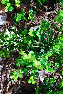
Around the garden things are frying. Some plants do very well in the heat though. Like the thistles. I have a lot of weeding to do once the weather cools down enough to get out in there.... But my side garden is thriving. Do you remember what it looked like when it was planted back in September last year?
![]()
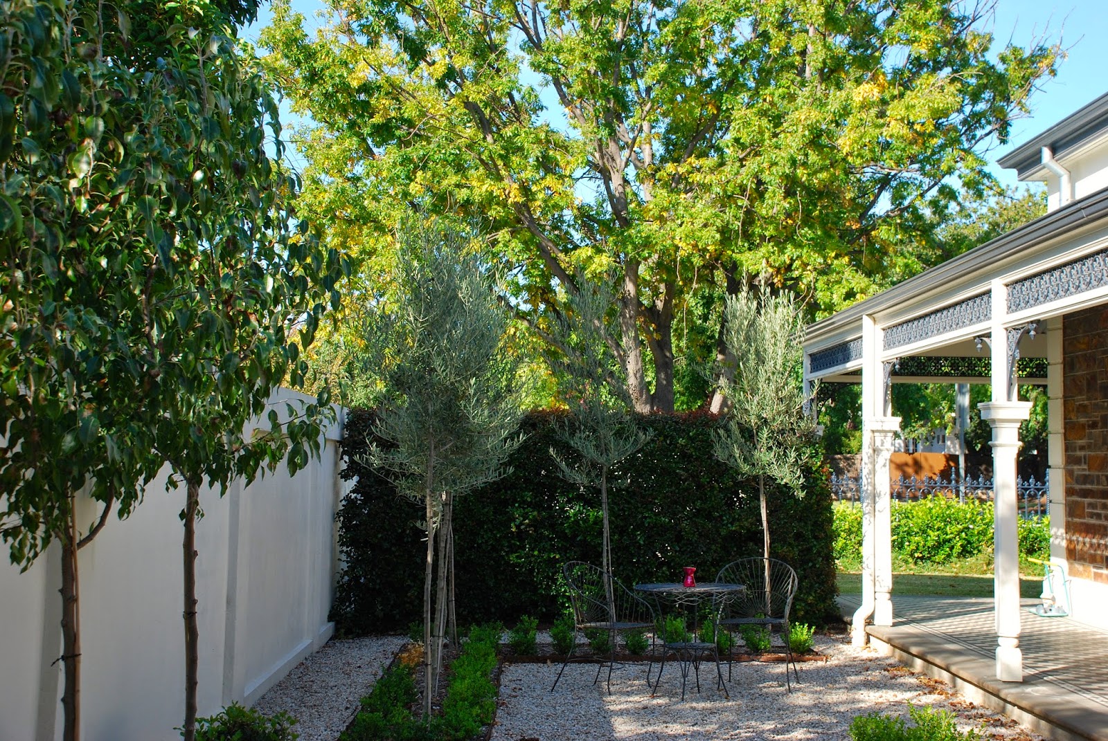
Here it is now.
![]()
The trees are probably more than double the size they were, and the hedges are looking really lush and healthy. They're actually noticeable now, rather than when we first planted them and they were barely visible. I have to get out and paint the white pipe too - it's for the solar heating for the pool, and is a bit of an eyesore. Eventually the rose will grow up it and conceal it.
![]()
![]()
![]()
I have olives growing in the olive trees in here.
![]()
And figs growing on the new fig tree in the back garden. Excitingly the parrots have not yet discovered them, so I haven't had to net the tree and we've been picking them and enjoying them in a baby spinach salad with blue cheese, toasted pine nuts and balsamic and olive oil dressing. So yummy.
![]()
The upside of the heat has been the (very) balmy evenings. Last night in the evening after the two youngest children were in bed, Mr AV, our oldest and I played a few rounds of Petanque on the new court. The adults played with a glass of chilled Rose in hand.. it was very pleasant to be out in the garden on such a warm evening. We need quite a few more plants in this area (it's largely unplanted aside from the hedges and trees), but things are growing, and it's all looking good.
![]()
Hope you're enjoying your weekend.
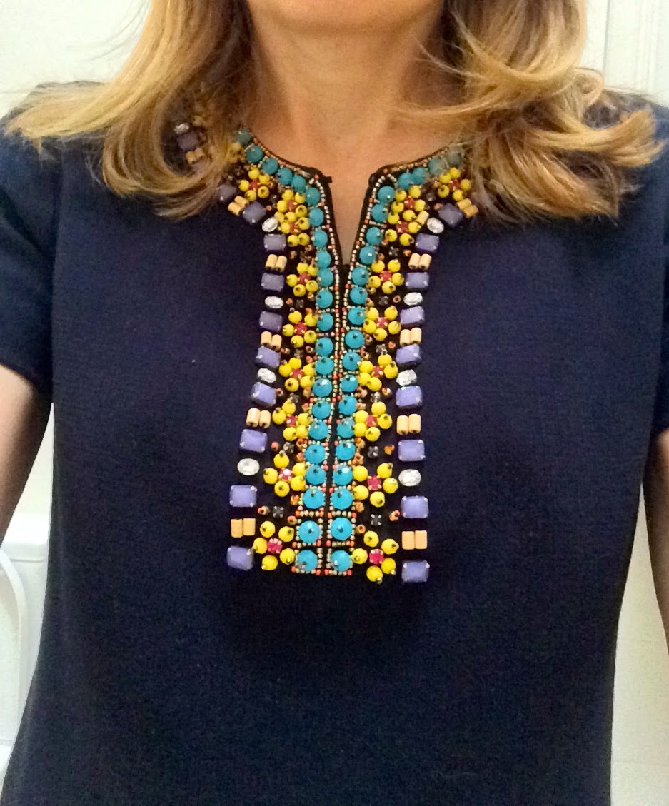
Mr AV and I went out to dinner together to From Orient in the city. I wore this navy Tory Burch shift dress, which has a sparkly neckline so negating any further accessorises. Easy dressing. Food was delicious, service was lacking.


This also lead to me deciding to clean all my silver, as I was staring at a tarnished pen pot during most of the writing. Now the Christening mug/ pen pot is all sparkly, plus the toast/ letter rack, letter opener and my tea strainer and various pieces of cutlery and salt and pepper pots. I was also prompted to clean the silver by the fact that I went to Costco on Friday morning and bought a 6KG bag of Baking Soda. So handy for all my cleaning jobs! I like to put a mixture of vinegar and bicarb down the drains every few weeks to keep them clear, as well as using it for other cleaning tasks and baking and as a result I get through the small boxes available at the supermarket fairly quickly.

before
The trip to Costco caused a few other things, like cleaning out the pantry. This was because I'd shoved all those bulk buy boxes of bits and pieces in it before rushing out to do other jobs, and it was a terrible mess.

after

the drawers weren't too bad though. It was mainly the shelves

I do love a trip to Costco, and I was very excited when they finally opened in Adelaide last year as I used to go all the time in Melbourne. The problem with our Melbourne house was that there was very limited storage, as it was so small… so I had to be careful not to overbuy. But now with a bigger house, and lots of cupboards and a cellar to store things in and a growing family it's perfect.


My favourite things to buy are the books (perfect for kid's birthday party presents), the bunches of 24 long stemmed roses (as above in the photo on my hall table), the gift wrap ribbon (latest purchases were ombre pink and an ombre green wire edged 50m in a roll), the discounted movie tickets, the incredibly cheap petrol, and the fresh produce which is very fresh, very good quality and about 1/4 the price of my local supermarket.

I've caught up on my design magazine reading. I have to say the best thing about the latest Architectural Digest was the ads. I will be cancelling my subscription. The English House and Garden never disappoints, and Veranda is also reliably good though.


Here it is now.

The trees are probably more than double the size they were, and the hedges are looking really lush and healthy. They're actually noticeable now, rather than when we first planted them and they were barely visible. I have to get out and paint the white pipe too - it's for the solar heating for the pool, and is a bit of an eyesore. Eventually the rose will grow up it and conceal it.

first planted

now

I have olives growing in the olive trees in here.

And figs growing on the new fig tree in the back garden. Excitingly the parrots have not yet discovered them, so I haven't had to net the tree and we've been picking them and enjoying them in a baby spinach salad with blue cheese, toasted pine nuts and balsamic and olive oil dressing. So yummy.

The upside of the heat has been the (very) balmy evenings. Last night in the evening after the two youngest children were in bed, Mr AV, our oldest and I played a few rounds of Petanque on the new court. The adults played with a glass of chilled Rose in hand.. it was very pleasant to be out in the garden on such a warm evening. We need quite a few more plants in this area (it's largely unplanted aside from the hedges and trees), but things are growing, and it's all looking good.