Quantcast
Channel: Adelaide Villa
Viewing all 236 articles
Browse latest View live

Can we all stop pretending a Hermes Avalon blanket makes cheap furniture look expensive.

$
0
0

It's time for a reminder of the children's story The Emperor's New Clothes. This is because I suspect that many of the adults out there on the internet have forgotten, or have never read, this life-lesson story of blindly following the pack and being hoodwinked in the process.

 You'll need two of them for your kid's room

Up there with the myth that a $4,500 handbag will miraculously elevate your $20 chain store polyester dress and plastic shoes to couture level, is the parallel myth in the Interiors world that the Hermes Avalon blanket will imbue your Ikea sofa, cheap coffee and side tables, and shiny cheap lamps with the cloak of luxury, high end design.


This blogger was celebrating her birthday, apparently she woke up with a topknot bun on her head, and had a lovely breakfast spread that was colour coordinated to her home decor with the Moet label turned to face the camera. So lucky!


Type in "Hermes Avalon Blanket" to pinterest and read the gushing captions

"Hermes Blanket - a must have (in my dreams)"
"Chic"
"so Classy!"
I loved this image of the stiffly draped blanket on the chair dead centre in the image.

Rather than paying $6,320 for a blanket, I'd suggest putting the money into better quality lamps/ the furniture in the room/ a decent rug/ some art/ your mortgage (or getting one in the first place if you're renting) instead of something you'll spill your cup of tea on and that the dogs will lounge around on when you leave the house for the day.


If I see another magazine spread with a carefully folded Avalon blanket- on- sofa in an otherwise ordinary interior/ or instagram photo of a nursery in a suburban brick veneer house with the $2,000 baby version folded over the cot I shall scream.

Baby version

It's not exceptional design, it doesn't trick anyone into thinking you're a multimillionaire, it doesn't make your Ikea sofa more comfortable because it has a cashmere blanket artfully propped on it…

No expensive blanket could save this room

While The Blanket no doubt came to prominence due to being used in very high end interiors where the fact that the interior also featured lacquered walls, custom made upholstery in fine quality fabrics, and original art that all combined to give the room a feel of substance and quality… it somehow has been misinterpreted by people who have honed in on the blanket and decided that if they put that into their house and skip the rest it will magically transform into a high end interior too.


So before you buy your $6,320 blanket to impress on your friends that you have more taste and money than them, think about what it might impress on a few others - that you (or your dog) are in fact lounging on a modern day version of The Emperors New Clothes. Although I suppose at least it will keep you warm when you can't afford to turn the heating on.

All images via Pinterest by typing in "Hermes Blankets"

Barbie Style

$
0
0

I have never owned a Barbie doll.


Not one.


This was because my Mother was of the mind set that Barbie was a bad role model, portraying unrealistic ideals of feminine perfection (it was the late 70's and early 80's). Funnily enough, despite my Mother's reservations about Barbie's lack of positive career role modelling, she has had every one of the careers that my Mother's three daughters have all grown up to have - Engineer, Architect and Vet. And at last count Barbie has had over 200 different careers, which is far better than any of us.

In London

Of course banning her just left me craving Barbie dolls as a child, and I'd play with them obsessively when let loose with a friend's collection - especially all those tiny plastic shoes. Now with a daughter of my own, I have taken a more relaxed approach to Barbie's physical perfection and I'm fairly ambivalent  - my daughter has one or two Barbies given to her by friends, but is at any rate more interested in dressing up her bigger dolls.

Milan

So while I feel no inclination to purchase a Barbie doll of my own now as an adult, I do, however, find myself hankering after her Wardrobe. Forget the Fashion Insta bloggers - I've been following Barbie Style. Barbie sports the latest looks from all the big name designers, including perfectly accessorised shoes and bags, and of course never has to suffer the horror of a Bad Hair Day. She also seems to jet off to all the major Fashion Weeks, regularly attends Gala Balls and generally seems to have a far better life than anyone else I follow on Instagram.

Paris

But aside from any inspiration Barbie's high fashion style might afford, I came across this recently released ad, which I loved so much I thought I'd post it here. It perfectly captures the big world view of possibilities ahead for a child without the cynicism of the adult projected on it.


House and Garden update

$
0
0
Last week I was fortunate to have a few wins at one of the local Antique estate auction clearance houses. One of the items I was very, very keen to buy was this Georgian style (likely Edwardian) serpentine wing-back armchair. It has solid mahogany legs, original nailhead trim, and the original horsehair loose seat cushion.


Naturally it will be reupholstered, the orange velvet was likely not the first covering it had, but at any rate it's very threadbare and tatty and needs to go (as I vacuumed it more of the pile was sucked out). I'm going to have it in our casual living area, where I think it will contrast nicely with the more modern furniture we have there. 


Of course, that lead to what to cover it in. This is clearly a Statement Chair, but how much of a statement to make it? Long time readers will know that my living area is a sea of neutrals… or has been, up until I had a rug made earlier this year with coloured spots in it, and also purchased a Designers Guild throw rug which has some of the same colours in it in varying sized stripes. One thing lead to another and I have finally decided to finish off this space. I've currently got 14 cushions in motion with the workroom in varying colours and sizes which will hopefully arrive soon, and so what to cover the chair in started to become a little confusing. 


I could go with a bold colour, picked out from the cushions and rug… but I worried that with the chair already being antique and very different from everything else it would be a little too much of a statement. Then there was texture - I was drawn to velvet, but was concerned it would feel visually 'hot' when Adelaide's peak temperature runs of 40C in Summer started. In the end I've decided that it will be upholstered in a Manuel Canovas chenille (low pile) which won't look 'hot', and in a neutral mole grey/brown colour. But to tie it in with a little addition of the colour elsewhere in the space, I'm planning to use a contrast cord piping in tones of green/plum/reds on the arms. The nailhead will hopefully all be reused - it's a lovely mellow toned brass, and I'd like to keep as much original detailing as possible. The horsehair chair pad will go though - it's flat as a pancake and not comfortable at all… I'm thinking of redoing it with a down cushion pad.


I have a feeling this chair will be the favourite in the room. Men in particular love a wingback armchair due to its generous size, but the children are also drawn to it - perhaps it's the feeling of enclosure it gives at head height? A feeling of security perhaps? After its new upholstery has been completed it will go on one side of the fireplace with a modern table next to it for drinks, and probably a library lamp like this in bronze.

via 

I'm also planning to complete the seating in general at long last in this space. The two sofas are fine, but I'd always planned to have a pair of armchairs on the other open side to offer different seating options (a variety of different seating options in a conversational seating space is always a good idea - there is no single chair/ sofa that suits all people for all social circumstances). This is one shape I've been thinking would work - a good combination of modern with traditional proportions, and a reasonably elegant design.

Via Maxalto

I can't remember if I've updated the blog with the lamps in this area too - I know I put them on Instagram, but a pair of these bronze sculptural table lamps are on either end of the sofa now, so I'm finally getting close to sorting this area out. The last room in the house in fact (odd given its our main living area). 

Newish lamps

The other item I purchased at the Auction house was a gilt mirror. The frame is very old, ornate and weighs a tonne. I think it probably had a painting in it once upon a time, although the mirror now there seems quite old. At any rate it's going to hang above the handbasin in the guest powder room. 

Insert mirror here

A room that has been mirror less since the renovation. I've been waiting to find something the right size (everything was always either too big or just tiny or horrendously expensive), and the right style of course. 


The gilt has a lovely age to it, and I think it will look fantastic in here. I'm getting my picture hanging woman in to hang it, as I'm concerned that due to the weight if I have a go at it we might hear an almighty crash one day...


 A few people have asked about the front garden progress. The main part of the works have been completed - we have a tree to source still, and are waiting on the perennial grasses to appear in the plant nurseries, but it's nearly there… just need everything to grow!


I'm so pleased with the fountain - it looks like it's always been there, and the base is a very realistic cast iron looking fibreglass, so I'm happy with the quality of it all. The fountain itself (bronze) is starting to age with the green patination it will have.


We love the overall design, and have had a very positive reception from friends and family on it too (although that may be because they were looking at the dead grass for 10 weeks prior). The planting has gone into the gravel as well - the idea is to soften the margins between gravel and plants. Eventually the plants will all spill out over the gravel from the beds. Can't wait.


The plants have a lot of contrast foliage - spiky things, grey green, dark burgundy and lime green leaves, strappy leaves, things that are soft and pretty like roses and grasses, lilacs and prunus… with the trees all planted in the garden now it brings the total in the entire garden to around 42 that we've planted to complement the original 2. The garden prior to our ownership was heavy on the flowers and bushes. In some ways I can't believe we've fitted in that many trees, but it's a reasonable sized garden, and trees give much needed structure that was lacking before.


In the back garden my roses that weren't decimated by parrots eating the buds have put out a few sun bleached blooms

David Austin's Golden Celebration

And everything is growing like mad. I love this corner of the back garden - the textural and colour contrast is beautiful. The tree at the front is the Forest Pansy with its leaves that change to dark green in another month or so, then bright golden yellow in Autumn.


 There are a few patches that need to be filled in - I have some seeds coming that I'll propagate to add into the patches - some salvia ground covers with interesting flat leaves.

So, I think that catches things up somewhat - not long until I can say the house itself is 'finished'… well, sort of. I think things always evolve, so maybe not that finished after all!

Mixing High and Low in Interior Design

$
0
0

There was quite a fuss in the comments of my recent blog post on the subject that I will now refer to as The Blanket I Dare Not Speak The Name Of, as a couple of anonymous commenters misinterpreted the post and thought I was saying you couldn't mix high and low priced items in Interior Design/ Decoration. Especially given that they strongly felt you were able to do so in Fashion. Now, I thought my blog title summed things up quite nicely, but to reiterate - if you rely on a single, expensive item with dubious design merit to give all the impact/ quality in your interior, and skimp on all else in a room, then that one item is not able to magically transform the room into a picture fit for a magazine cover. The same holds true in fashion. One bag does not an outfit make. It's all about the mix. Failure to mix it successfully in fashion will instead have most people assuming the expensive bag is a fake due to the combined effect of the entire outfit. So, I thought I would do a post on how I mix high and low priced items in Interior Decoration, something I have referenced numerous times in other blog posts but that has never had a stand alone post of its own.

JK Place Hotel, Capri

Seating - I've written a previous post soley on Sofas, and my advice remains the same. It is worth investing money into something you use everyday, that you require high levels of comfort and functionality from, and that makes up a major part of the interior decoration in your living area. A cheaply made sofa is a waste of money. The blog post I wrote about it linked above also talks about how to buy a quality sofa for reasonable prices if you cannot afford to go out and buy a custom one, or one from a good retailer off the shelf. A good sofa does not end up on the footpath for the council Hard Rubbish collection day after 5 years. It should last you more like 20 plus. It doesn't have to cost a lot of money, as I detailed in that post, but it should be viewed as a true investment. The same holds true for Dining chairs, armchairs and any other form of seating. Comfort is key, and quality is evident in these large items in a room.


large baluster lamps via

Lamps - I prioritise money for lighting, and have probable written too many blog posts on this topic already. It has, I believe, one of the biggest impacts of any single decorative item. But I have purchased both inexpensive and expensive lamps in my time. The cheap ones can be fine stylistically, but you can't expect them to work after 3 years, they'll just self destruct. However, if you want to mix high and low with lamps, look for large sized bases in Bunnings/ Beacon Lighting/ Freedom etc and get a custom lamp shade made, or buy one in the appropriate size from a higher quality store. The lamp shade will make the difference in the appearance of quality -the cheap chain store lamps always have awful shades to go with them. For some reason too, we tend to have undersized lamps in Australia in mainstream retailers. Large lamps on side tables in a sofa area will give a lot of impact (around 70-80cm high). At first your eye might read them as too big, as you're used to the visual size of a small lamp, but if you want a "Designed" look without employing an actual designer, then this trick will add a bit of oomph to your scheme - Scale up.  Scale up in size for anything - pendants, lamps etc… But if you can stretch to a decent amount for your lamps it's completely worth it. You'll get something that looks unique but has a functional component to it as well. I put a lot of work into lighting schemes, and feel this is what sets a room apart from another when looking to generic vs designed interiors. Pools of light are always a better way to light a room, and one common mistake I see is where rooms are solely lit by overhead lighting. Lamps, lamps and more lamps. They just pull a room together.

Large area rug with seating on top via

Rugs - I think rugs also make a huge different to a space, but this doesn't have to be expensive. I will usually do a custom design if possible to ensure that the colours, pattern and size all work in harmony in a space -it can be hard to find something perfect in all three areas off the shelf. But if your budget doesn't extend to a large size wool/ silk rug, then go simple. Sisal is perfect. It's casual, but works with traditional or modern interiors. If you have smaller good quality rugs already you can layer them on top of the sisal… but the trick is again to go big with the base rug size. Your rug should ideally run at least under the legs of your seating areas to unify and delineate the space, and go bigger than that if you can so that the furniture is all sitting on top of the rug with no legs off it. It gives a sense of luxury to have a very large area run in a sitting area, or under a dining table. The one thing not to do with rugs is to buy cheap synthetic patterned rugs, or rugs that have been poorly knotted. They will detract from your interior. If you can't afford good quality, then don't try to buy a cheap imitation - you'll always hate it. Instead use sisal, go big, and save money that way.

large Sisal area rugs via

Occasional furniture - Side tables and coffee tables. This is one area I fairly consistently go cheap on. All the mass market retailers have good offerings, and as this is furniture that is not moved around/ sat on etc it doesn't much matter if it's so sturdy as other things in the long term. I've found tables I like at Pottery Barn and West Elm and have examples from both in my house - they're surprisingly good quality. Coffee tables can be a problem if you need a large sized one for a large seating area (as I have in my casual living area) as they aren't stocked commonly in large retailers. I ended up buying a custom sized one from a good Australian furniture designer, however alternatives are to have a group of coffee tables of varying heights/ sizes (but the same style) and they can fill the space in well if you need something big.

The much instagrammed Halcyon House interiors by Anna Spiro

Cushions - these are the accessory that make your interior scheme really come to life, and I can't emphasise that enough. First thing in the quality stakes is the filling in the cushion - banish the poly fill as they always look like pancakes after a year or two. I always have feather or feather/ down filling in mine (the trick if you are buying the inserts yourself is to size up from the cushion size so that it is plump and full always), the visual fullness speaks luxury, not to mention they're more comfortable than poly fill when you actually sit on them. As for the cushions themselves, I prefer custom cushions rather than the off the shelf ones from mass market stores which are often pretty cheap looking up close and made of inferior fabrics. If you don't think you have the budget for custom cushions, look to etsy.com for pre made cushions in fabrics from the good fabric houses. Some of my favourite sellers are Aurelia , Arianna Bell  and Elegant Touch. Alternatively you can buy designer fabrics as remnants from eBay - curtain makers in the UK will often sell off 2 or 3 metres of leftover fabric, or pre made up cushions minus the filling. If you search by the designer brand name (Colefax and Fowler, or Designers Guild etc) you'll find plenty on offer in short lengths perfect for cushions to sew up yourself, or to have someone run up for you. But do allocate a decent amount for the cushions. When I'm doing a sofa or armchairs for a client I'll price up the cushions as well… the cushions are often quite scary looking in the quote, but they really make the whole thing come to life and are definitely worth the investment.


Art - I love the quote above, which sums up my thoughts exactly. If you have white walls (which applies to pretty much every Australian open plan living areas now) then you need a lot of Art to visually fill in the space. This is one reason why the gallery wall has become so popular. The individual pieces are not particularly special or expensive, it's the sum of the whole that has an impact. My personal approach to art is just to buy something I love. I don't worry a lot about resale on a piece of art- it's only relevant if you go to sell. Only the very clever insiders in Art can reliably make money off it, so I know my limitations and just get what I love. Art doesn't mean just the painted version however - I've done framed Intaglios in my bedroom, there are prints (Artist's limited edition works on paper are particularly affordable), I buy things through local estate auctions, you can buy a vintage poster, frame a scarf - there are a myriad of ways to fill in the visual blank of walls.

via Pentreath-Hall.com

The key is in hanging it - if you have individual small pieces, group them together on the wall. Anchor small pieces of art with furniture (just above a side or console table, a buffet etc) and in general the biggest error I see is hanging art too high up the wall. The bottom third to half of the artwork should be at eye height for an average adult (about 1.7m off the ground). If you are hanging art in a dining area then hang it lower again, as you'll be viewing it sitting down at the table.

 Framed Vintage Bathing suits via

 anchoring a group of art above a chest via

Decor items - go cheap. Shells, stacks of books, wood objects… search the local estate auctions/ flea markets and you'll find all sorts of interesting bits and pieces. If you want to make it work in harmony then using trays on coffee tables to group objects together works well, or blocking items by colour on a table (stack of books in a particular shade, which matches something else like a piece of china), or by grouping by material type (items in stone or wood). Add in flowers or greenery with impact - scale up.

Interior by John Coote at Bellamont Forest in Ireland

I will sometimes prune branches of trees in the garden and I'll bring the cuttings inside to fill a vase. I will go against the fashion for fresh though as I don't mind using faux as well. Adelaide can be very hot in mid Summer, and buying or cutting flowers from your garden is a waste - they are dead in 3 days. The modern silk flowers and greenery can look really convincing, so I don't mind using them when necessary. Particularly the faux orchids as the real have a death wish in my house.

Same view as above, minus the branches used for the English House & Garden shoot

And of course the main thing with interior decoration is to just do soothing you love. Pull out your good things, don't worry too much about what is in "good taste". The major problem with Interiors at the moment is that everyone is so busy depersonalising it that it's becoming bland and soulless and the same, and that was my main problem with The Miracle Blanket. Tick -a- box supposed good taste is just dull - don't rely on one slightly in- your -face branded item to make your interior stand out. Unless you are selling your house, don't make it look like that's what you're trying to do by appealing to everyone. Someone will always hate the way you decorate, so accept it and move on. The rooms that don't offend are also the most boring and don't excite. It's your house, so do what you love and others will enjoy it to. They might not want to live in your interior, but that's fine! It's not their house. People enjoy spaces that have a bit of personality to them, so get out your China if you like to see it, paint a room in a colour you love - don't play it safe.

Lee Radziwill's Paris apartment - hot pink sofas, striped chairs and framed Botanical prints

Previous blog posts on mixing high/ low in architectural design Where to Save and Where to Spend in the renovation of your house can be found by clicking the link. A post on Architectural tricks to improve the box like extension of the typical Australian home can be found by clicking that link.


"It takes a couple of generations to understand Wicker"

$
0
0
exterior by Marco Meneguzzi

This quote is much bandied about, and attributed to many. However wicker is not something, I believe, that requires much generational understanding - it's long been admired and used in products as diverse as baskets, trays, handbags, and seating for both indoors and out and used cross culturally and for centuries due to its adaptability. Perhaps the quote came about because of the durability of rattan - the material commonly used in the manufacture of wicker furniture and objects. Rattan furniture is strong enough to be passed down through generations, one reason why it still holds so much appeal.


Rattan itself is a type of climbing vine that grows in rain forests , and produces long, thin branches. The branches are harvested, debarked, sanded down and then woven into the product. It's entirely environmentally friendly - the Rattan plant will regrow and due to its reliance on large rainforest trees to climb up, it's meant that natural rainforest has been left intact in areas that are now suffering from large scale deforestation (such as Indonesia).


The term "wicker" is a general term, used to describe woven product made from anything natural and of plant origin - bamboo, straw, cane and rattan.


Wicker furniture has been around since the Egyptian period, but its popularity really soared during the Victorian era, when conservatories and palm houses became highly fashionable and a process of manufacturing was invented that mimicked rattan, but that made it durable and allowed for a finer weave- Lloyd Loom. Lloyd Loom furniture (this refers to a manufacturing process, rather than a specific brand name) is not made from a plant based material - it's wire with paper twisted and wrapped around it to make a durable, thin and long lasting fibre that is easily woven and shaped. While Lloyd Loom in its original format is still available today, the modern version of this is the plastic wrapped wire - UV stable, able to be left outdoors year round and therefore more suited to modern life without an army of servants to carry the pieces indoors when the weather becomes inclement.

 Interior by Marco Meneguzzi

And perhaps that is why wicker furniture has such romanticism attached to it. Images of wicker conjure up languid afternoon teas in the garden. or reclining on sun lounges in palm fringed conservatories, or sitting outside a cafe in France.

Bunny Mellon's back hall via Architectural Digest

However, wicker has not just stayed stuck in the Victorian/ Edwardian era in styling, but undertook a revamp in the 1950's and 1960's when using materials in innovative ways resulted in a period of radical reinvention of furniture design. Many of these styles are still available today.


I've been particularly taken with the wicker designs of Sika furniture (a Danish company), who have produced rattan furniture since the 1940's and who had Arne Jacobsen, Nanna Ditzel  and Franco Albini to design pieces for them that are still in production. These particular designs are not suited to outdoor use, but their use in interiors is what has interested me at any rate. Nanna Ditzel invented the original egg chair, which is much copied, but still manufactured by Sika


And pieces by Arne Jacobsen such as the Charlottenborg chair and table come in a variety of colours and fit in modern or more transitional interiors.


So, wicker is not all just about French bistro chairs (heavily in fashion in recent years).


But if you don't feel that the furniture has a place in your house or garden, then you can always spring for a wicker bag and carry it around instead. 


Renovation - Casual Living room progress update

$
0
0

I have shared very few overall images of the casual living area on the blog… mainly because while I've been very happy with the Architectural element of it, the actual decorating has been the last thing that I've turned my mind to. Up until now it's all been fairly temporary or very much a work in progress.

 looking up to the ceiling lantern - windows on two sides

 The silk dots always show up much whiter in photos than in real life.. it's not that strident.

The sofas were purchased at the end of the renovation, so we've had them for nearly 2 years now. One is a four seater, the other a 3.5 seater and they are upholstered in a very fine slate grey and beige woven linen. I tend to do upholstery in main living areas in neutrals, and then bring in the pattern in other things - on an armchair or cushions or in the curtain or blind fabric. However having the neutral sofas sitting there in a neutral room for so long started to do my head in. I craved a bit of colour and pattern.


Early this year I started the ball rolling by commissioning a custom rug from The Rug Establishment. I wanted something that would break up the geometry of the space - there are a lot of rectangles and squares, and also to introduce some colour. I also wanted it to feel contemporary, so the design of the spotty rug with four different colours in it and neutral background ticked the boxes. After that I pulled a couple of the colours out with a throw rug from Designers Guild which also added in another couple of colours with tonal variations of pink and plum that complemented the rug.


Scatter cushions with green the predominant colour also helped to tie in with the outdoors. I designed the extension on the house to feel like a modern conservatory (in a way). The big steel windows and doors really help to give that feel, and bringing in more green with the cushions added to the light and airy feel I was wanting. The yellow cushions are more of a chartreuse colour (thank goodness… while they were being made up I started to panic that they were going to look too much like the dreaded Green and Gold colour scheme that is Australia's sporting colours), so they tie in with the green nicely as well. As our sofas are extra deep, all the scatter cushions have made a big difference in making anyone that isn't over 6' more comfortable sitting on them…


I've written before about the new table lamps, but they have sculptural bronze bases and compliment both the steel windows and side tables as well as an existing wrought iron floor lamp that was made by a family friend as a wedding gift many years ago (he is a master blacksmith). So with the soft furnishings largely taken care of I turned my attention to the Elephant in the room. The TV.


viewing point as you enter the extension from the hall

There are two things that couples tend to argue about when decorating. One is the sofa choice, and the other is the size and location of the TV. Mr AV and I were no different. Originally it was going to be hung over the fireplace and covered up when not in use with a painting, however the fireplace space wasn't large enough, so we would have to have a small tv (unacceptable to Mr AV)  and with a very high French mantlepiece I was concerned we were going to get sore necks looking up at it at any rate. So we just plonked our existing TV on an unattractive pine chest in the corner while we argued about it for the next year and a half. Eventually I wore Mr AV down and the TV has now been mounted flat on the wall that is not visible when you enter the living area.


I wanted it to go here because my main concern was that it not be seen when you walk into the living area from the hall. I always have what I think of as a 'viewing point' (I have no idea if this is an actual design thing, it's just the way I think of it) in a room. It's what you see as you enter the space, and it sets the tone for the room. I like my viewing point to be inviting. A giant black void of a tv screen is not. It draws the eye and distracts from all the other good things in a room. Additionally I didn't want our living area to revolve around the tv. I prefer a focal point of garden windows and the fireplace, not a blank screen that guests line up facing when you have people over.


So by mounting the tv on the wall that you don't see as you walk into the room it just visually disappears. It could be the frame of a painting from side on. So successful has this been that I've had to point it out to two visitors in the past week after I've told them I've moved the TV as they have been standing in front of it facing out to the garden and haven't noticed it behind them.

glimpse of the tv from side on

The difference this has made to the overall feel of the room is immense. Without the box and tv of old it feels much less cluttered and temporary, and more spacious and airy.


Planned changes for the future include the armchairs… our new point of argument! Plus there will be another lamp and table to put in-between them.  I will probably have more cushion covers made in velvet for Winter too. The colours will be in the warmer palette taken out of the rug and throw rug, rather than the fresher greens and yellows I chose for summer.


As for styling of the room, I really haven't bothered much…. The chess set on the coffee table was my families, with the board made by my Dad and the pieces bought in England back in the 70's (they are replicas of the oldest chess pieces found) he gave it to our oldest for his last Christmas present as he is chess mad, and it's played with most nights. The books are just ones that I'm currently flicking though, and other decorative bits and pieces tend to annoy me on the coffee table unless they fulfil a function. So I mostly keep it clear.

So, that's progress for the time being on this room with lots more tweaking required. Having never really done a proper post on it I thought it was well and truly about time!

Sources:
Sofas - Jardan "Leila"
Side Tables - Pottery Barn
Table Lamps - William Yeoward
Cushion fabrics - Designers Guild
Throw rug - Designers Guild
Floor rug - The Rug Establishment - custom
Coffee Table - Zuster - custom
Wing Armchair - Small & Whitfield estate sales
Flooring - Linoleum

Renovation - The completed powder room/ WC

$
0
0

This room was essentially completed almost two years ago, aside from one thing - the mirror. Now that I've finally found and hung it, I thought it was time that I showed the completed powder room / guest WC. 

During construction, the corner taken out of the room.

To refresh your memory or to explain if you didn't follow along with my renovation posts from all that time ago, the powder room was created from a tiny bit of the carved up original kitchen, pictured during construction above. The old kitchen was turned into one of my children's bedrooms (post here on the before and after of that), and this room was created by stealing a corner of it and knocking a new door in from the adjacent hall. 


The new door was in fact old: we reused one of the original doors that had been rendered redundant during the renovation in the old part of the house a few years prior, and put one of the nicer old brass door knobs on it from another door. 


This room was to be for guests, not children, and being in the older part of the house, I wanted to do something interesting in it. Otherwise it would really end up feeling like no more than a cupboard. I was keen to use wallpaper to create interest, and the wallpaper I really wanted to use was De Gournay. I figured that having lusted after it for nearly 15 years I could probably afford it in the smallest room in the house… however it was not to be. It was still just too eye wateringly expensive.


So my next choice was this Schumacher grasscloth with an overprint on it. It's hand blocked so it's not exactly a budget option, but it was still considerably less expensive than De Gournay. The main problem that I had was that it was sold on an 8 yard roll (American lengths), and not available in double rolls or in one continuous length which limited the number of drops you can get per roll. It also had a large pattern repeat, so the combination of the two factors meant that I was only able to get one wallpaper drop per roll due to my high ceiling heights. This caused it to start going into the pricing of the De Gournay due to the excessive waste, so my solution was to do a dado level panelling, which enabled me to get two drops per roll, and thus cut down by half the cost of the wallpaper.

I didn't panel this side to make it easy to clean. Now I think I probably should have still panelled it.

I designed the dado panelling, higher than normal to match the hand basin height and matched the style to the Victorian era door panelling elsewhere in the house. The other thing that I wanted to do due to the small space was to create a continuous flooring in from the hall, so that it didn't seem so separated an element with a change. I continued in the floorboards that we'd used in the hall (Spotted Gum), which also gave less of a 'bathroom' feel. 


The toilet model was part of the job lot I purchased for the house 5 years ago along with all the other bathroom items at a warehouse sale in Melbourne, and is from Duravit. The handbasin was the big bargain in this room, coming from Recollections/ Early Settler and costing only $99 in a sale. Tapware and assorted fittings are from Astra Walker and are in the same style used elsewhere in the house, but in unlacquered brass, which has now aged down nicely to match in with the patina on the mirror.


And as for the mirror, well that was the part that took the longest. I wanted to find an antique gilt mirror. I like things with a bit of age, and didn't want something super shiny and new looking. Unfortunately supply in Australia of old mirrors is fairly limited. A lot that are available are far too large for this little space, or the ones that were the right size were very, very expensive. Additionally while I love old mirror glass, sometimes it starts to become so distressed or foggy that you can't see in it properly. This wouldn't be a problem hanging elsewhere, but in a powder room it wasn't so ideal. Finally I found the mirror at a local Estate Auction, and it's perfect. 

As for lighting, I've kept it simple. There was wiring done for sconces on either side of the mirror, but I changed my mind when the wallpaper started going up, so they're sitting there behind the plaster. I thought they'd be just a little bit too much. The room is lit during the day by a fixed velux skylight (clear so you can see the sky through it). There are two LED down lights for night, and that's it. 


So, the littlest room in the house completed at last.

Sources:

Handbasin - "Manhattan" from Recollections/ Early Settler
Taps & accessories - Astra Walker 'Classic' range in unlaquered brass
Toilet - Duravit
Wallpaper - Schumacher Celerie Kemble "Hothouse Flowers" in Fog
Mirror - Small & Whitfield estate auctions
Floors - Spotted Gum wide floorboards


Apologies for the photos not lining up - blogger seems to be having a few hiccups and won't let me align them tonight. I'll try to fix them up again later.

Food, Garden, Books

$
0
0


We have had a very hot start to Summer, with temperatures above 40C (104F) for the past few days. For this reason I never decorate with snowy themed Christmas decorations - it just feels all too wrong. While the fashion for flocked (fake snow dusted) Christmas trees has finally hit Australian shops, I prefer to theme with greenery and silver tones, which feels slightly more cooling on a hot day.


I've been baking up a storm since our long school holidays started  (Romy's Chocolate biscuits about to go into the oven are pictured above). One thing I've been meaning to share on the blog is a literally life changing discovery I have made. I think I first became aware of Martha Stewart using mini ice cream scoops to measure out cake batter during the occasional time I caught her tv show, and I probably filed it away somewhere mentally. Earlier this year I decided I was sick of uneven height cupcakes, remembered the ice cream scoop thing, and so bought a small one from Wheel & Barrow to ensure easy measuring and distribution. This was so successful it then lead to hunting for smaller and smaller scoops suitable for biscuits until I found The Holy Grail of Scoops - the OXO brand small sized biscuit/ cookie scoop. I bought it from Williams Sonoma, and  it is no exaggeration to say that this thing has changed my life. The speed with which you can scoop and release is unprecedented, and the fact that all my biscuits are now even sized is very pleasing to me. It's the little things...


Of course the biscuit distribution then lead to the next progression - using it for other things, which is where it has saved so much time and been life changing on a busy week day. Family dinners are generally fairly trying at our house. I have one fussy eater, and children who in general all have different tastes. Some one will be crying/ sulking about what I've served pretty much every night of the week. But one thing the entire family enjoys are meatballs, and I have a variety of different meatball recipes that I turn out. Unfortunately they can require a lot of pfaffing about with teaspoons and hand rolling etc. But the scoop works for these too, and it's cut the prep time down to about a minute for an entire batch of meatballs. 


Here are a favourite above - Ottolenghi Chicken and Zucchini meatballs with Sour Cream sauce from the Jerusalem cookbook. They are supposed to be burger sized, but meatball sized works better for children and can also work well as finger food with an adults drink party.The meatballs are also gluten free, and the recipe is fantastic - tasty for adults and kids. 


Another favourite are classic spaghetti and meatballs, which I make using a Bill Granger recipe (minus the chilli). It has a lot of herbs so they have a fresh flavour and the bread in milk trick makes them stay moist. If you have a thermomix (as I have) then meatballs are the easiest thing in the world to make as it does all the grating, chopping and mixing for you, so a batch of meatballs from start to getting cooking will take around 5 minutes. 


My second big food recommendation is not quite so life changing but has helped speed things up as well. It's a pancake pen, pictured above and purchased also from Wheel & Barrow. I don't use this for actual pancakes, a ladle does just as well for that, but for pikelets and blinis it's perfect. I'm a veritable production line churning them out for an after school snack/ lunchbox filler or for drinks with smoked salmon. 


In big news around the house, the long awaited Dining chairs finally arrived. This was perfect timing as another two of the old dining chairs broke in the week leading up to their arrival, so things were getting desperate. They are so comfortable I'm pretty sure our next dinner party will be a very late one. For all those interested in why I've chosen an upholstered chair having in the past pointed out that with children they become repositories for food, these ones have a clever design that solves the problem. The covers are removable and are velcroed under the seat, so they look fully upholstered, but can be wriggled off and washed as needed. The chairs are from Molteni & Co, and I purchased them directly from an Italian online retailer as the local importer price gouged so badly that they had added a fat 120% margin onto the full retail price + shipping+ tax + import duty comparable pricing from Italy. 


The garden has been growing like crazy in the heat, although we have woken this morning to cooler temperatures, rain and grey skies (which are very welcome). While my roses have mostly fried in the past few days and the flowers are looking a little crispy, other plants just love it. The Crepe Myrtle is shooting out in all directions and putting out fuchsia coloured flower heads.


All the perennial grasses have gone crazy


Back corner of the garden

Same garden bed a few months ago in Spring

This is the bed outside the kitchen window. We are growing wisteria up the veranda posts on wires and it's finally got going. I know it's going to be a pain to keep in control in latter years, but the purple flowers against the grey render in spring will make it all worth it.


I've also planted out a whole heap of black flag irises in the garden and can't wait for them to bloom. I have a thing for dark foliage plants and flowers.


Baby irises to the front, mini agapanthus to the right

a lone David Austin Heritage that's opened out

It's been a while since I've reviewed any books - this is because I've not read a great deal as the end of year has been so busy. But Faux Fuchsia recently sent me this book on Nancy Lancaster, and I absolutely loved it. Nancy was a founding partner in Colefax & Fowler, the venerable English decorating firm, and lived an interesting and quite pampered life (she was independently wealthy, plus married into money several times over). Her fascinating with houses with patina and age and layers and her ability to create a mood in a room was unparalleled, and she is credited with creating the English Country House look, which is amusing considering she was originally from Virginia in the USA. So much of the book resonated with me with her philosophy on decorating, I highly recommend it. The main thing I liked was that she bought things that she just loved and felt right, rather than what was in fashion or was considered the best quality by others. She would happily mix high and low well before that was a concept.  


If you're looking for an unusual gift for a garden lover, then this book will appeal. It's vintage style cover grabbed me - it is a reissue of the original edition of "Down the Garden Path" by Beverley Nichols. I picked it up when visiting Hobart a few months ago.


Here he is on the back cover.


He was a very popular writer in Britain, and wrote a semi fictional series set in a country village. This was his first book, written about the creation of his own garden, and the descriptions of purchasing an English cottage, his difficulty with his domestics, and trying to find plants that would grow in his garden are very entertaining.

With all the hot weather my sun dresses have been getting  a work out. I rarely write anything about my own wardrobe on the blog these days, I'm really not sure anyone is interested… but I've had to purchase a couple of new sundresses to replace a few that were looking very worn out after hard service. This one appealed to me in its vaguely Dolce & Gabanna style tile print. It's from Binny and is a tent dress in a thick cotton, so not only cool on a hot day, but good for expanding waistlines over the Christmas period!


 Busy times, but I think that's caught things up a little. Hope you're not being baked wherever you are in the world and that all your end of year prep is in order.

A trip to Vietnam & Singapore

$
0
0
British Colonial style in Singapore at Raffle's

We've just returned from a family holiday to Vietnam and Singapore, as those of you who follow along on Instagram will be aware. Vietnam seemed like the perfect family holiday destination for us as it's a relatively short 2 hour flight from Singapore, and it would expose our children to a totally different culture to that of home. We also wanted it to be a holiday centring on relaxation - it's been a busy year for all of us. So Hoi An in Vietnam ticked all the boxes. It's located on the coast in the mid part of Vietnam and while it is technically currently Winter there, it enjoys a tropical climate, so it was a mild 25-28C most days. Warm enough to swim, but not so hot that walking around the old town of Hoi An was unpleasant.

 Temple rooftop in Hoi An resplendent with Dragons

 Hoi An was formally a trading port, and is now Unesco World Heritage Listed with an interesting mix of Japanese, Chinese and French Colonial Architecture dating from the 15th - 19th Centuries. Mr AV and I had holidayed through Vietnam 11 years ago, and loved it then, so I suppose you could say we'd already done some reconnaissance regarding the logistics of a family holiday and did not feel particularly daunted about taking youngish children there. Personally I feel it is a far safer destination than Bali, which is the default Asian family holiday spot for many Australians. 

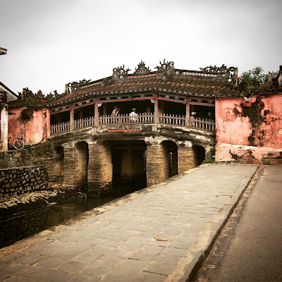
The Japanese Bridge, which dates to 1590

Inside the bridge there are several shrines, this one has a monkey

Timber post construction inside the Japanese Bridge

We stayed in two hotels whilst there - the first, Anantara, is located on the river very close to the old town which made it easy to walk into the centre with the children. It's designed in a French Colonial style, and was a lovely base. The second hotel, Nam Hai, was one of the resorts located a 10-15 minute drive out of town on the beach and comprised the 'relaxation' element of the trip. It's been designed by a French Architect in the style of minimalist, modern Chinese pavilion style, and is very elegant.


While all the resorts on the beach offer free shuttle bus services into Hoi An town, we felt that when our children became tired it would be far easier if we could just walk 5 minutes back to the hotel (or rickshaw them there while the rest of us walked), rather than wait for the next shuttle to a resort, hence why we broke the trip into two separate places to stay.

The two youngest being cycled in a rickshaw back to the hotel

You can get direct international flights into Da Nang (the nearest large city approximately 30 minutes drive away from Hoi An), so it made for an easy travel destination all round. The car ride did not seem long to the children as they were completely fascinated watching the traffic and the lack of apparent road rules, the strange things being carried on the back of scooters (animals, stock for shops), and the families of three on one scooter zooming past. While I would have loved to go back to Hanoi and also shown them Hue (the former imperial city), we decided staying put in Hoi An would be the go this time around. It was also easier to navigate due to the lack of traffic - the old town is blocked to scooters and cars, so is perfectly safe for pedestrians.

A street full of tailors

A shop that sold bamboo bicycles and straw baskets

Hoi An is charming - it's famous for its many tailors, although having overindulged in bad tailoring 11 years ago I avoided them like the plague this time (no one with a 12 hour turnaround time is going to do a stellar job in my opinion).


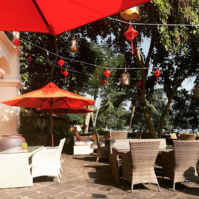
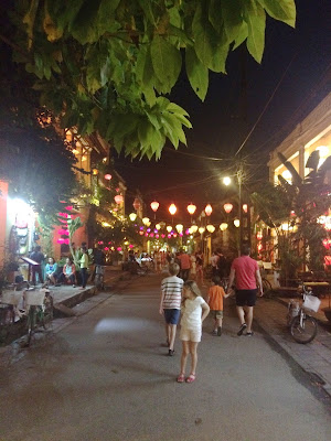
They are also well known for their hanging lanterns, made in all different shapes and covered in silk, which are strung up all through the town and lit up at night to give quite a magical effect .


Other Vietnamese specialties are well represented in the town shops such as lacquer, objects made of Water Buffalo horn (they shed them naturally and they are then crafted into small bowls, salad servers, necklaces and hair pins), beautifully hand embroidered linens and bags and items made from silk. Sadly there are now a reasonable number of shops selling polyester Polo Ralph Lauren polo shirts and vinyl Louis Vuitton and Mulberry bags - I suppose it is inevitable that when Western tourists arrive in any quantity in Asia these items start to become popular, and from conversations I overheard most visitors left with entire new suitcases full of extra stuff they'd bought.


The children found the bartering aspect fascinating (and the performance that goes along with it), and the fresh food market with the stallholders produce set out on the sides of the roads - mounds of fresh coriander, ginger, salad ingredients, dragon fruit, women walking past with the traditional shoulder poles carrying baskets with fresh fish in totally them eye opening. There was a stall that sold live chickens in small bamboo cages (not sure whether to eat or for eggs, but you do see a lot of chickens wandering about roadside just out of town). It was no sanitised Western style market, and nor are the buildings a scrubbed clean Disney- style old town. There is a lot of patina in Hoi An still. It's all surrounded by rice paddies tended by workers wearing traditional conical hats and Water Buffalo and was a good eye opener to our children as to how people in other countries live.

French Colonial style at Hill Station cafe in Hoi An

I have always loved Vietnamese food and all bar one meal we had was exceptionally good (that meal was in a tourist trap style place that overlooks the river where they float lit rice paper lanterns down in the evening. The food was ok, but definitely not exceptional. View was good). Vietnamese food relies on fresh, clean tasting ingredients with lots of herbs. Hoi An has a lot of seafood locally caught, and the dressing and sauce flavours are sharp/sweet/clean tasting without so much of the chilli heat other Asian countries, such as the Thai, have. They are also very fond of a baguette, and their pastries are delicious (the French influence). Our favourites were the White Rose dumplings, a specialty of Hoi An (they have shrimp and pork in the centre and are very delicate in flavour and texture), and the Vietnamese Omelette, Banh Xeo, in which you cut the omelette into pieces and wrap in a section of rice paper with fresh herbs and salad leaves before dipping in a sauce served on the side. Delicious and something I'm going to look up to make at home. The small clay Hot Pots of curry are also worth trying, so delicious. 

some sort of green mango salad and shredded chicken for lunch


One restaurant I'd recommend (and we ate there 11 years ago and enjoyed it then too) is the Brother's Cafe. It's just out of the old town, near the Anantara Hotel on the river. It's got an absolutely charming courtyard to dine in on the river, and at night is lit up with lanterns.

Brother's Cafe in Hoi An, which is housed in a French Colonial style building

All up it was an excellent family holiday - the highlight for me was walking out of the hotel one morning with an enormous bag full of laundry and having the 4 women, who have enterprisingly set up laundry services at the gates, begin fighting for the job. If only that happened at home. Returning home with a suitcase full of clean clothes after a family holiday was a miracle in itself.


There was also a lot of design inspiration all around me. While we didn't buy a lot, the beautiful details in the Hotels in both Singapore and Vietnam, the French Colonial and Chinese influences of the old town of Hoi An, their use of colour, traditional screens, pots and mood lighting were all inspirational in themselves. I could really get a sense of where the Australian/ British Interior Designer Anoushka Hemple found inspiration.

tiny tea pot

And as for what my souvenirs of the holiday were (aside from the happy memories and many photos), I purchased a tiny tea pot for one with tiny tea canisters of tea leaves from TWG tea in Singapore. You can buy the tea in David Jones' stores in Australia, but the range in Singapore was far larger, and the teapot was so charming I couldn't resist. The teapot has an insulating sleeve around it and literally brews only a single cup, so is perfect for me.

Halong Bay, still from the movie Indochine

My Hoi An purchase was a set of napkin rings carved from a single shell for each. They're apparently made up in North Vietnam in Halong Bay (If you've ever seen the movie starring Catherine Deneuve, Indochine, then you'll remember the stunning beauty of Halong Bay which was the second star of the movie, and if you haven't watched the movie then seek it out as it is beautiful). Another great movie, shot around Hoi An, is The Quiet American starring Michael Caine. And with that I think I'm off to do a binge watch of both those movies and relive a fantastic holiday. Hopefully we will return to Vietnam far sooner than in another 11 years.

Shopping

$
0
0

It comes as a surprise to many that know me to find out that I don't really enjoy Shopping. Yes, I love fashion, but the link from that to finding shopping an enjoyable pastime is vast in my mind. I find no pleasure in the aimless wander through a suburban mall, and tend to find large stores crammed with 'stuff' overwhelming. There's too much choice! 

Collins St, Melbourne outside the Georges Department Store circa 1950's.

But give me a small, specialist store and I'm in clover. I love a perfectly, tastefully curated array of well made, quality things to choose from. Unfortunately stores like this are in the minority and have to be carefully sought out, as the modern model of fast fashion and volume sales means they are rare in the face of the onslaught of loud, intrusive musak, overly bright lighting, and racks and racks as far as the eye can see. Who is buying all this stuff?  


A book I recently bought was "Remembering Georges". Georges was a small Specialty Department store in Melbourne, and I can probably only equate it to Liberty in London in both size and style of content for overseas readers. The book is a collection of interviews the author undertook with past staff and customers - the store closed for good in the early 90's after 120 years of service. 


What it highlighted to me was that all the things that make shopping an enjoyable social pastime have disappeared in today's shopping experience - it's really no wonder Internet Shopping has filled the gap so successfully in Australia. Georges had things that were eye wateringly expensive in it, but conversely it also contained well priced, good quality wares as well. What they all had in common were that they represented the best of their type. The main point of difference between Georges and other stores (aside from their superior stock which their buyers scoured the world for) was the overall experience and ambience of the store. There was a tea room, a hair salon, no one was pressured to sell and so no one was pressured to buy. It was well serviced by staff so that if you did require assistance there was someone helpfully on hand who knew their stock and the provenance back to front. Purchasing something was a special experience- the item would be carefully wrapped, even if inexpensive, and packaged up beautifully. A long way from being thrown into a plastic bag with houndstooth print on the side, even if the item cost thousands….The one thing all the reminiscences touched on was that there was space around the stock - there were clear aisles uncluttered by bargain bins and racks of clothes, there were chairs placed around the store to sit in if you needed to for a while… these things are all gone in modern Australian department stores, and are one reason why stores like Myer are a nightmare to me. The thumping music, the visual clutter… it's oppressive and far from pleasant. 


It's a fabulous book and I enjoyed it so much. If you're interested in Social History post WW2 in Melbourne, currently work in retail, or used to enjoy shopping there in Melbourne then you'll love this book. And for those wondering why this wonderful shopping experience obviously failed after a long time… the store was purchased by a larger department store, who changed the stock to the same as the large department store a block away, and the model of sales and style of the store, and ran it down until had to be closed down. 


Coincidentally, I had ordered another book recommended by a commenter on Faux Fuchsia's blog called "Orchids on your Budget" which dovetailed neatly in with themes touched on in the Georges book. It's a reprint of a small and entertaining book first published in 1937 and is essentially about living with flair on your budget.  Lots of the lessons in this book made me feel like I was listening to my Grandmother talking about where to spend and save, and how to spot good quality amongst the dross. 

I've written before about my Grandmother's philosophy - she was thrifty and frugal, but had flair and could sniff out good quality at 100 paces. It occurred to me when reading this book that the demise of the Home Economics classes in schools has been a great loss to all for those who weren't taught these things by their Grandmother or Mother (or Father). I don't think it's progress that life skills are no longer taught to school children (budgeting, basic cooking, sewing and cleaning), especially given that with busy households that rely on takeaway and outsourcing of chores, and the rise of consumer credit (and lack of budgeting that sometimes accompanies this) that there's no leading by example (and I feel that both boys and girls would be advantaged by this…). I've noticed that very few young people have any idea on finding things that fit them well, or that they're able to discern the difference in quality of fabrics, since Home Economics classes fell out of favour. They're simply unaware as pretty much no one home sews anymore. It's all ready- to- wear, and not particularly well fitted/ constructed at that. When even the Duchess of Cambridge constantly wears ill fitted clothes (many of them from the High Street she so loves, but some of the made to measure is equally poorly fitted), you know that the disconnect between the knowledge of garment construction and the consumer has been complete.


Made to measure Alexander McQueen coat with lumpy lapel, poorly aligned buttons and waistband, and straining top buttons. 

Back to the Georges book, one of the people interviewed was Christine Barro, who was the accessories buyer during the 80's and 90's until the store closed. She went on to open her own accessories shop in Flinders Lane, Melbourne, called Christine. I visit every time I'm in Melbourne for a browse, and when I was in there last year, I got chatting to her in the store while I admired some beautiful costume jewellery in one of the display cases. 


The store stocks all manner of things from umbrellas and hats to bags, sunglasses, scarfs, gloves and jewellery…. and after a lot of though I bought a long necklace, made by a Paris atelier called Goossens. Christine brings in all sorts of unusual things, and Goossens, it turns out, have an interesting history. They produce the famous Sautoir necklaces for Chanel, and have done so since they were first designed in conjunction with Coco Chanel in the 1950's. I had been drawn to the necklace in the display case and had commented to Christine that it was very Chanel like, minus the logos, so it was no surprise to then find that they made the costume jewellery for Chanel, Yves Saint Laurent, Balenciaga, Dior and many others. If you're ever in Paris they have a showroom at 380 rue Saint- Honore to visit, which is definitely my kind of specialty shop. 


16 year old Joseph tuxedo Jacket bought when living in London, white silk Joseph shirt bought in last January's sales and the Goossens necklace

I think it's a classic piece and I've worn it a lot already with jeans/ trousers and a white shirt or top, or as pictured above with jeans on my way to the movies on Friday evening. 


So in terms of "Orchids on your Budget" I've stayed strong in the face of overwhelming numbers of emails entreating me to buy in the Internet Sales (and I've spent a lot of quality time unsubscribing from lists), and I've yet to set foot in a physical shop in Adelaide for the January sales… but I did buy one thing in the Netaporter sales. I'd been keeping my eye on it for weeks, waiting patiently until it dropped to 70% off. I have a feeling my Grandmother would have approved. It's a Lela Rose sheer lace coat (above). Not exactly a practical day-to-day item, it's definitely more a special occasion thing… but I think it's a timeless cut and will jazz up a plain black dress or trousers and top combo and providing I don't stack on the weight will be something that I'll be able to wear for many years to come. 


 So.. shopping. Still not my favourite pastime, but if I happen to be passing a small specialty shop on a high street with interesting bits and pieces in it you can guarantee I'll make a detour in for a browse. Somewhere along the way though, the race to sell cheap items at volume to the masses, rather than the single perfect thing to the individual has taken over the retail scene in Australia and not necessarily for the better. It's a great shame that the inducement to buy, and fast, has replaced the social aspects of browsing and carefully selecting.. and the old message that less is more.

Design and Crime - Stuart Rattle

$
0
0
entry via "Stuart Rattle's Musk Farm"

I'm not usually one to pick a book from the True Crime genre, however when it revolves around the murder of Stuart Rattle, one of Australia's most lauded Interior Decorators then it piques my interest.


For those uninitiated, Stuart Rattle was a highly regarded Australian Interior Decorator in his 50s, murdered by his long-term life and business partner Michael O'Neill two years ago. O'Neill plead guilty to the murder, thus sparing a long, drawn out trial that would no doubt have been filled with salacious detail as their lives were picked apart. He has never divulged exactly what it was that lead to the murder on that night (it appears unplanned), preferring to 'protect' Stuart's legacy. Suffice to say that he is extremely remorseful, is a broken man, and it seems to have been an out of character crime.

Stuart Rattle

The author of this book (who only writes in the True Crime genre) wrote about Rattle and O'Neill's life in a biography of sorts, with the detail provided through interviews with the families, their friends, colleagues and former clients, adding in her own slightly sneering asides (she has no understanding of design/ why people would hire a designer/ how wealthy people live) and distracting personal stories. There is clear sympathy toward the murderer, and she portrays Rattle (whom she had never met in person) in a very unflattering light as a driven, exacting perfectionist and thoroughly nasty person. He seemed to be widely loved by suppliers, clients and his many friends and was charismatic and personable. After reading it all, I felt like having a bath in disinfectant.

Corner of the Library

At first it was essentially an account of a wholesale makeover of a life - from their respective starts in country Australian towns in the 1960s with working class families, the bullying they each endured due to their sexuality (O'Neill quite severely), their respective wholesale makeovers in Melbourne into urbane upper class men about town, and then it gradually evolved into a tale of when business goes bad. Despite being at the top of the tree in the Australian design world, and despite decorating houses for people worth tens and hundreds of millions of dollars (and more), Rattle's design business was imploding due to complete and utter mismanagement. When Rattle died, there were 56 jobs on the books - all run by just O'Neill, who acted as his assistant. This is an extraordinary number of jobs to have on the go in an office being project managed by just one person.

The kitchen at Musk Farm

Design itself is a fraction of the overall job as a Designer. Successful execution involves meticulous planning/ checking/ double checking and an awful lot of paperwork and project management. From what was written in the book, it would seem this was not being done well, and things were falling apart at the seams as a result - clients were angry their projects were taking so long or that things were turning up incorrectly made, suppliers were not being paid, clients were not being billed and everyone was confused as to where things were at with budgets. Additionally they were not making a lot of money considering their client base (taking home approximately $300,000/ annum between the two of them, but spending $700,000 on living expenses). 

Outdoor pavilion

As part of the so called "A Gay" scene in Melbourne they were certainly looking the part, mostly due to borrowing money from the business accounts, and utilising the business overdraft facility for their own personal expenses. At the time of the murder they were propping up the bank accounts by syphoning off money from their Superannuation (pension) fund (illegally), had a $130,000 overdraft with the bank and $90,000 on credit cards. The money had gone toward living at a level of perfectionism and luxury in their homes and lifestyles similar to the life their clients lead, the difference being their clients had incomes with many more zeroes on the end. The Melbourne Antique dealer Graham Geddes had some interesting observations to make on the business aspects of working in that world and commented specifically on that point.

Bedroom

It's an interesting glimpse into their lives, but ultimately it was the descriptions of what went into his renowned farm that were the only saving grace in this voyeuristic book. I already have a copy of "Stuart Rattle's Musk Farm", a book  written and photographed immediately after his death to memorialise it prior to the house and contents sale. The additional information on the interiors from the "Smoke and Mirrors" book was interesting, especially that almost all the 'antique' furniture in the house was in fact new - made to his exact specification by a specialist furniture maker as Rattle had neither the patience to wait for the right piece to turn up, or wanted very specific sizes and styles which can prove impossible to find in Antiques.

Formal Sitting room via "Stuart Rattle's Musk Farm"

I will be upfront and say that I'm not overly fond of the house and interiors themselves - they are too heavily Anglicised for me, and I personally find the house top heavy and awkwardly proportioned due to the conversion Rattle undertook of the structure from its original single story school- house to two story American style farm house (complete with flag over the front door). However, I am clearly in the minority, as it's been widely lauded as a building and interior of immense beauty and style, and it certainly has a sense of place. The gardens are beautiful, and the overall estate is interesting.

Musk Farm

I had a very mixed reaction to the book. As I said upthread, it did leave me feeling like taking a disinfecting bath due to the very voyeuristic information contained within, and the lack of any impartial journalistic- style of the part of the author. I'll be interested to see if there is a biography of Rattle's work and life published by a more sympathetic source in the future, or if the Musk Farm book is the only one we'll see - certainly his family wanted to emphasise to the Author of Smoke and Mirrors (prior to refusing to meet with her again) his natural talent, and the fact that he was completely self taught with no formal education - this was a point of pride to them.

As I have recently read a few books along the theme of Design and Crime recently, I will follow up this post at a later stage with another - next will be the mysterious disappearance of Jim Thompson, and his celebrated house on a Klong in Bangkok, both books of which I enjoyed and perhaps have less of a mixed reaction to than the subject of this blog post.

Hardy Amies Letter to his Antipodean Goddaugher "abroad with a pedigree"

$
0
0
About a year ago, I searched out a copy of an article from Vogue Australia circa 1987. I was curious as I could remember reading it intently as a 13 year old, and viewing Hardy Amies (the English Couture designer) wardrobe pronouncements on the matters of taste and style as gospel.

Hardy Amies via Getty Images

I had always been disappointed that it was only the second part of the letter that I had read as a 13 year old - I remember wondering what was in the first? What gems of information had I missed? Well… when I searched out the letter in the Melbourne Library archives, I found the first one. Eureka!

Cindy Crawford in UK Vogue 1987


Or not quite. This one gives advice to his goddaughter, Susie, on social matters. Including how to broach the British upper crust. Advice that is slightly questionable, and most definitely hilariously dated in modern day terms. Thank goodness I didn't read this and take it as gospel! For many reasons as you can now read for yourself….

From Vogue Australia, March 1987

Dear Susie,

It was so nice seeing so much of your mother on her recent trip. When you get to my age you treasure old friends. I suppose I've known you all thirty years - it's that long ago since I first went to Australia. I was tremendously flattered when your mother asked me to be your godfather. I fear I have not been a very good one: I always remember your birthday too late to do it justice. I'm grateful that you never hold it against me.

So I've now decided to make amends and carry out your mother's wishes that I should write to help prepare you for your visit to England - and I expect Europe, next year. Of course I'm frightened of boring you; I'm sure I shall tell you things you already know. But bear with me: I am having fun sorting out my own thoughts. At its best I should be giving you advice on how to live, the summing up of experience. I shall be happy recording this, it's something to leave behind.

Remember I was brought up with much less money than you and I've had to fight my way to what I've managed to achieve. I can remember mistakes and pitfalls and can warn you. I can also recall little triumphs and will pass on the secrets. My main school was, of course, the shop. I learned how to understand the rich by waiting on them, like a good butler. Like a good butler, I am a snob.

A good snob respected the social structure: a bad one idolises it. Snobbery does not mean cruelty, unkindness to friends or guests, it means a clear evaluation of social position which is only discreetly discussed for fear of hurt.

Your mother is sending you to England to help your education. You know, they know and I know that everyone hopes you make a stunning marriage.


I seriously suggest that you should start at the top. You already know a good deal about Australian snobbery. The snobs of Sydney and Melbourne are the nicest people there. They have helped to make Australia great and they are determined to do their best to keep it so. It's the same thing in England only it's better organised.


You've heard about Debrett's. It's the most fascinating, incredibly accurate account of English history. Wildly useful, it places you in the world immutably. My tip is, consult Debrett's as soon as you get to London. Don't talk about it - people are self-conscious - they pretend it doesn't matter. But you've only to look at the detail, the family ramifications that are given and which are all supplied and kept up-to-date by the families themselves. It's all taken very seriously but never discussed. This is important for you. It's also importent to get titles right. Never be frightened to ask.

Don't be lazy about looking up people you are introduced to, particularly chaps. It's not necessary to seek out titles: that is unpleasant snobbery. But someone with land or prospects or in Debrett's is very desirable, You know exactly what you're getting. Who's Who is also extremely useful. It gives full scope to the self-made man and to the self-made family, which, of course, all those in Debrett's were originally.

I've just had a thought. The higher you go in the social scale the fewer poofs you are likely to find. I don't know why. All strata of society today are of course very tolerant of poofs. It's very middle class to do anything other than to accept them. They do indeed brighten up the scene everywhere. But I'm not sure I recommend them as husbands. There have been very successful marriages. He will help with the house running, even if he doesn't cook he'll know about cooking. And God, won't he be interested in your clothes. But you'll know the dangers. It takes a very fine athlete to be good at tennis as well as golf.


I am totally in agreement with your mama when she says she thinks you ought to get a job. I think she said that you were keen to. Don't ever give the impression that you don't need the money. But, on the other hand, you can afford to take work which teaches you rather than makes you a profit. Interior decorating, dress designing and even one of those courses at Sotheby's are a bit overdone. Have you ever thought about gardening? Don't faint. It's the great, new, chic thing to do. There are well-run schools in London such as the Chelsea Physic Garden. Then if it appeals to you, you can go to Water Perry which is near Oxford. It would be wonderful to be a real professional and be able to control the gardeners with authority.


Tell dad you must have a little car. He'll understand.


As you're only eighteen you could do the course for six months, then you should consider going to France for a year. You must learn French. That slightly, undisguisable Aussie accent is very attractive, don't  make any mistake, but you must be able to hold your own in French. Don't go to Paris, there's too much English spoken there, as there is in the south of France. You want a fairly well-to-do bourgeois family in a provincial town like Lyons or Tours. I'll talk to you later about it all. It's so easy to learn a language before you are twenty-one. You'll never get such a chance again. The same thing applies to history.


I remember taking you to The Magic Flute about six years ago. You were very absorbed by it and quite delighted with the music. I know you are a sensitive and intelligent girl. So you'll have to stay in what is called upper class society and I hope you'll raise yourself higher. I did it by my work. You will do it by your looks.

If you keep to yourself well aware of the standards of your background - and you're lucky that you have nothing to be ashamed of- you'll find that it's axiomatic that you have a fuller life in the upper echelons than you do in the lower. A full life means creative and provocative friends, an interest in fashion (all its aspects not just clothes) an understanding of music and painting and particularly architecture (with an emphasis on the domestic). I don't have to mention things like cooking and housekeeping. Your mother is a wonderful teacher.

Australian upper class life is without doubt based on European standards: not slavishly of course, but basically. Then to feel at home in Europe you must know as much as you can about European history. Don't bother about the early days of the Plantagenets and the Tudors. The Stuarts are truly amusing and you are bound to come across some of their descendants.


I'll give you some more detail another time. And, of course, I'll allow myself to offer some observations on dress. You will sniff disapproval, I think you must make up your mind how chic you want to be. Being chic is largely a question of discipline. You have to be very strict with yourself and allow no sentimentality - no birthday present bracelets and brooches. You can afford to try to be chic because your sense of humour will soften it all and no freckled redhead like you will ever be frightening. But you'd better get some of those curls cut off. There has never been a chic woman, in my time, with long hair. I embrace you….

For part 2 - click here

Design and Crime - the Mysterious disappearance of Jim Thompson

$
0
0
hem of my Mother's Thai silk wedding dress

I've long held an interest in Thai silk, and this probably stems from my Mother's own love affair with it. Back in the 1960's when my Mum was at University, she befriended a Thai student. The lasting legacy from that friendship was that my mother was married in 1967 in a Thai silk wedding gown made of silk sent back from Thailand by her friend C. The other legacy was that my older sister, born some years later, was given C's unusual Thai name which apparently means "character". If you have met my sister, then you will definitely think she lives up to her name quite nicely….


The gown in all its 1967 glory

But back to the silk. Thai silk was all the rage in the 1950's and 1960's, a traditional handicraft that had been transformed into a very large industry post WW2. By the 1960's there were probably a hundred different Thai silk manufacturers, of varying quality. My mother's wedding silk was fairly typical of the more elaborate weaving and embroidery methods that were by then being utilised, and the edge of the long straight train and hem of the dress were woven with silver thread, with small silver embroidered medallions scattered through the body of the fabric. It was a fairly typical style of 60's wedding gown for its day, and after the wedding Mum had the train shortened, the sleeves taken off and neckline lowered to turn it into a ball gown to get more use out of it. Sadly this meant that by the time I came to be married I couldn't use it myself as it was by then rather the worse for wear from too much partying.

The Drawing room with doors opening to a terrace via The House on the Klong

While many people think that Thai silk, now synonymous with the country, was always there, it was in fact an industry almost wholly created by an American Architect and ex CIA agent named James (Jim) Thompson. He spent some time in Bangkok after the Japanese surrender at the end of WW2 with the US Army, and fell in love with the exotic culture. His return to the US was a short lived one; he discovered his wife had had an affair with his best friend, a blow that left him a confirmed bachelor, and he decided to sever ties with the US and move permanently to Bangkok. As an aesthete he immersed himself in traditional culture, something that was not fashionable at the time in Asia where they were aping the West and rushing to catch up on development. He amassed a huge collection of traditional antiques, art, fabrics and porcelain travelling all over the country in search of items to complete his collection. Simultaneously, he was developing the Thai silk industry. When Thompson arrived in Bangkok, silk weaving was a traditional handicraft practiced by a very, very small number of people and was truly on its way to dying out. It was largely undertaken by a small ethnic minority group of Muslim families who lived beside a Klong (Klongs are Canals, and Bangkok was called the Venice of the East due to the network of Klongs that used to run through the city, many of which are now gone and replaced by large multi lane roads instead); their relative isolation from the rest of the Thai society meant that it had not died out completely.

The other view of the Drawing Room via The House on the Klong

It was neither prestigious, nor given much interest by anyone, but Thompson became fascinated with the silk and the traditional methods of weaving. With his artistic background and practical sensibilities (such as introducing synthetic dyes which were more vibrant, colour fast and uniform in end result) he began to have the silk woven in colours and patterns never before seen, and with his excellent contacts in the US he began to establish a market that soon clamoured for the vibrantly hued, shimmering silks he produced. Mass expansion resulted and the industry grew, with other manufacturers riding the coat tails to success. Interestingly Thompson himself did not become a millionaire from this - he had some fairly enlightened attitudes and had made weavers shareholders in the business. In fact he was largely disinterested in the money aspect, and far more interested in producing beautiful product, a freedom probably afforded by the fact that he was independently wealthy via family inheritance.

The dining room via The House on the Klong

When he decided to build a house for himself, he again went against the grain of what was at that time the fashionable thing to do - build a modern, Western style air conditioned house in Bangkok. Instead, he purchased from a variety of sources traditionally built Thai wooden houses, early portable homes if you like, as they were designed to be disassembled and stacked on a barge to be floated down a Klong to a new location if so desired. He purchased houses with patina and character at a time when people were essentially throwing out the old houses in favour of the new. Piecing several houses together to form his new house beside a Klong that overlooked his silk weaving district, he filled it with his collection of traditional Art, furniture, sculpture and porcelain, using the house and its overall style as a showcase for it - a sort of living museum. The house was completely different to anything else in Bangkok, and as a result became something of a tourist attraction (along with his shop, which was the first stop for tourists arriving in Bangkok at the time). People would turn up to the shop with letters of introduction from friends of friends of friends, and Thompson, a very social man, would invite them for dinner, no matter how tenuous the connection offered by the letter, where they would dine in splendid style amid flickering candlelight, and surrounded by ancient treasures by the inky black waters of the Klong.

Jim Thompson's house, now a museum

Then, in 1967, Thompson took a short Easter weekend holiday to the Cameroon highlands in Malaysia with friends to stay in a villa. This area is mountainous and was originally developed as an English Hill Station town (a place for the colonials to move to during the hottest months down on the plain). It was surrounded by dense jungle criss crossed with narrow and fairly rudimentary hiking trails, and at the time still had local Indigenous tribes living deep in the jungle. On the afternoon of Easter Sunday, the entire household decided to have a nap. It appears that Thompson wasn't feeling so tired, and so went for a stroll, leaving his cigarettes and jacket on a chair on the verandah indicating he wasn't planning to be gone long (he was a heavy smoker). No one saw the direction he went in, and he never returned. He simply disappeared.

Entry Foyer of the Jim Thompson house

An enormous search and world wide media attention ensued, and wild conspiracy theories began to fly about in the absence of any trace of him, due largely to his connection to the CIA over 20 years before. He had received extensive training in jungle survival during his time there, which gave rise to kidnapping theories, and slightly implausible thoughts of involvement from Vietnam and China as a potential "Quiet American" (as the Vietnam war was raging), and that he may well have been a covert spy (despite the fact that he worked incessantly in his silk business day and night) as it was difficult for people to believe that he could simply vanish without trace as he did. Two more plausible scenarios are that he became injured/ suddenly ill in the dense jungle, died and was never found (he was 62 at the time of his disappearance and known to enjoy going off track in jungles), or fell into a hunting hole dug by one of the indigenous tribes and when they discovered they'd accidentally killed a white man they covered it up so as not to incur the wrath of the authorities.

My own bit of Jim Thompson fabric in my Sitting room

At any rate, while the mystery will likely never be solved, it is his lasting and enduring legacies of the creation of an industry that became a backbone of the Thai economy, of the world famous fabric company that bears his name, and of his great architectural legacy- his house and collection on the Klong that remain.

Porcelain collection, screen and traditionally decorated chest of drawers via The House on the Klong


If you are in Bangkok the house is open for viewing, now owned and managed by a Foundation set up by his family after his disappearance. His collection of traditional Thai and Cambodian pieces contained within is fabulous, and it's a window into another era before Bangkok transformed into the densely populated, Western style city it is today.


If you are interested in learning more, two books I've read on the subject recently are "Jim Thompson the untold mystery" which is an extensive biography and discussion on his disappearance from someone who knew him in Bangkok, and "The house on the Klong" which is more a coffee table book and deals exclusively with his collections and the house itself, and surely used as inspiration by designers such as Anouska Hempel, who references the screens and moody lighting devices in her schemes. I can highly recommend both books.

My last post in this Design and Crime series will be on the novel "Rebecca", the author Daphne du Maurier, and the house that inspired the book.

Feathering the nest

$
0
0

Officially it's Autumn (although we are having the usual very hot March). Shop windows are full of scarfs and pea coats you don't want to even try on in the air-conditioned shop, the days are noticeably shorter and my sun dress rotation is becoming very boring.


I am preparing in my own way for the upcoming cooler months though by feathering the nest. Finally I have had the armchair I purchased at auction last year reupholstered. I ended up choosing a plum coloured Pierre Frey relatively large weave fabric to replace the original orange velvet.

The armchair before suffering from saggy seat

The upholsterer did a great job - he replaced the pancake like horsehair cushion with a down and feather one, redid the broken webbing in the seat, and redid all the antique brass nailhead just like the original. It's the favourite chair in the casual living area now, and we're all very happy with it. To show how the colour ties in with the others in the room you can see the plum colour is in the spots on the rug, and also similar in colour to the colours in some of the scatter cushions on the sofa.


Next up is a club fender for the fireplace. These are very common in the UK, not so common here in Australia. I'm trying to introduce additional seats into this area, and they tend to be a popular place to perch on where it's warm with a class of wine in hand when there's a crowd. I'm getting it done in the UK (no local manufacturers), and it will have an upholstered seat top in a light grey herringbone linen that matches in nicely with the sofas. The base will be a brushed stainless steel, so will work in with the speakers on either side of the fireplace and give a good blend of new and old. It will also mean there is a little bit of distance between people and the fire, which has always concerned me somewhat as the current set up doesn't seem so safe (we don't have the fire on when children are around as a result).


Another project that's just starting to gain momentum is the new garage. We had hoped to get moving on it last year, however the difficulties involved in the design meant it's taken until the past month for final development approval to come through from our local council. We have a tricky time with Heritage requirements for our street (our house itself is not Heritage listed, rather the overall street is protected), and this means absolutely everything is sent to the Heritage advisors for comment and recommendation (such as when we did a pool in our back garden that can't be seen from the street… it still went through Heritage).


The slow progress on this approval was due to the fact that we are incorporating a second level for accommodation over the car spaces. This will be for out of town guests, but will also do double duty as a studio for me to work out of. I've incorporated most of this space into the roof line so that it doesn't appear visually bulky from the street, and it has direct access to the street via a door and staircase. It will finally be a place for me to store the samples that are currently overtaking our Library/ meet up with trade reps and clients and get a little better separation of work/ home life which is all rather blurred at the moment. There'll be a kitchenette, a full bathroom and a murphy bed (concealed Queen sized bed that folds down from the wall). I'll post more as we get to the point of starting construction (currently the engineering is being finished off, then we need the building permit approved), but it will be an interesting project to follow for some readers as I'm trying to maximise the outcome for minimal expenditure - it's always interesting to me to see which are my most popular design posts, and they tend to be the ones about doing things cheaply. The ones on spending money…. not so much.  But in the meantime I thought I'd share a few of my design inspiration photos of garage/ coach house/ loft style conversions all from the Garages page on my pinterest.


Aside from that life has been busy. They call it Mad March in Adelaide as we have all the Festivals at once - Adelaide Festival of Arts, the Fringe, Womadelaide (world music festival), Writers Week and then the Clipsal 5000 (car race - I avoid this one). Coupled with just getting over the whole back to school information nights/ drinks/ getting children settled into school etc just prior and it's been busy.


Two weeks ago I went to see the James Trilogy plays (James 1, James II, James III), which was 11 hours in total (7.5 hours of theatre, the rest being intermission and breaks between the plays for afternoon tea and dinner). It was performed by the National Theatre of Scotland and the National Theatre of Great Britain, and was the headline act for the Festival of the Arts. Each play could stand on its own merits if you didn't think you could sit through them all, but seeing them consecutively was fantastic.  It was all very Game of Thrones- like with the political intrigue/ clan fighting during the 15thC and was obviously written just before the referendum on Scottish independence last year - the final monologue in the James III play was spoken to the audience about Scottish identity/ independence from England and it was a sort of hybrid between the 15thC in costumes and the modern era with language. It was absolutely brilliant.


Of course, sitting down for 11 hours throws up a quandary of what to wear. There were a few men in kilts in the audience, but having no Scottish blood myself, I opted for comfort by wearing my favourite Joseph stretch gaberdine leggings. I know, I know - leggings are not pants, but honestly, these are a thick (elasticated) fabric and really do look like pants. I've forced some of my friends to buy them too and they are similarly thrilled with the miracle nature of these pants - comfortable, you can wash them in the machine, yet good enough to wear to the theatre or dinner out. Mine were bought a year ago in the David Jone's sales at 50% off plus another 30% on top of that but I will be buying them full price when these wear out (I think matches and netaporter carry them).  I wore them with the silk shirt/ jacket/ Goossens necklace I blogged about a few posts back. Jacket necessary because even if its a warm day for some reason they like to make the theatre absolutely frigidly cold. I suppose it did give a very Scottish feel by default...


Continuing with the never ending summer, a few months ago I was telling my sister about the bargain Salvatore Ferragamo sunglasses I'd bought at Costco. I have an unfortunate habit of throwing my sunglasses in my bag at some point (after being very careful to store them in their case most of the time) where they inevitably scratch. I was particularly annoyed as I'd done this to a reasonably newish pair of Chanel sunglasses, and wasn't prepared to fork out for another pair. But my sister was unimpressed with my cheap designer sunglasses and told me that you can buy replacement lenses. Not only that but you can get them polaroid -something the designer sunglasses never seem to come in. In fact the saleswoman in Chanel went to great pains to let me know that my sunglasses were not legal to wear driving in Europe. I was able to reassure her that wouldn't be a problem for me… Anyway, back to the replacement lenses. They make the lenses for pretty much all designer sunglasses, mail them out to you and you just pop out the old ones and put in the new. If they don't carry your brand in stock, you can mail your sunglasses to them and they make a pair to suit and mail them back. Cost is around $60 for polaroid and less for the non. Can't recommend it more highly. The company is called Sunglasses fix. I've now replaced two of my old sunglasses lens and have three sunglasses on rotation.


Anyway, I'm off to do a bit of free magazine reading on my ipad before preparing lunch for the family. It's a long weekend here, and we've had a very lazy one after the past few busy weeks. I've finally managed to get stuck into the garden to do the weeding and pruning and having been too busy to download my usual rotation of about 20 design and fashion magazines from the local library I have a lot of catching up to do. Hope you had a good weekend.

view of the side garden

Family Friendly - designing a child proof house

$
0
0
via Pinterest

I was thinking about this topic after my three children had, over the course of 5 days which included Easter, scuffed walls, chipped off a large chunk of plaster off the column in the hall, felled the standard lamp in the living area breaking the socket in the process, peeled off wallpaper in the laundry, and tipped over a small mirrored table in Mr AV's study smashing the top. It wasn't a particularly good run, and we were very frustrated at the damage. Mr AV commented - "this is a very robust house, imagine the damage they would do if it wasn't?" and then started reminiscing about the damage he and his 4 brothers and sisters did to their parents house.

via Pinterest

I came to the conclusion a long time ago that you could have an 'adult' house as long as you design around the demands and practicalities of children. This means that you are not yelling at them all day long to stay away from things or berating them for ruining the house, and in turn you can enjoy your house without the worry of it looking like a child/ teen friendly space permanently. Adults and children can cohabit despite their different requirements, and I think it's a total cop out for people to say that they'll wait until their children leave home to buy decent furniture. When designing our house I naturally chose things that would work with our family and thought that it might be useful to list all the things that can be done to make a family friendly house that doesn't compromise on design. Room by room, here are the things that I've found work.

Living areas

If you have a casual living space that will be frequented by children there are several practical things you can do that will make life easier.

 indoor/ outdoor fabric that I used on a sofa for clients last year in a casual living area

Upholstering sofas in one of the new indoor/ outdoor fabrics is a great way to go. Every single fabric range has extensive indoor/outdoor fabrics in them now thanks to the new fabric technologies, and they are completely stain proof, ranging from fairly inexpensive, to top of the range with fabric houses such as Pierre Frey. If you love a light coloured sofa, but have toddlers, then slipcover a sofa in one of the new fabrics (the fabrics feel completely normal and not plasticky) and you can easily throw it in the wash and watch any stain be it vegemite/ chocolate or mud without treatment simply disappear. I've also used indoor/ outdoor fabrics in rooms frequented by grandchildren, where the grandparents didn't want to have to be constantly asking the children to take their shoes off or sit carefully (and instead wanted to be the 'fun' grandparents). This makes the sofa easy to spot clean with a bit of soap and water. Upholstery that is not a solid plain fabric also works better to disguise dirt. I usually select a fabric with a bit of 'movement' in it so that general dinginess will be fairly disguised. Our own sofas are a very, very fine check in tonal greys, and this has disguised dirt very well without going the route of the full washable slipcover.

grandchild friendly surfaces for my client - leather upholstered armchairs, indoor/ outdoor fabric on the sofa.

Paint on walls should always be washable acrylic - this is not a place to use distemper or any of the other more fashionable/ authentic paint finishes, unless you want instant child height patina.

Dining 

If you eat at a dining table with your children (rather than serving them at the kitchen island) then a dining table that has a robust finish to the top is optimal while children are toddlers. Our dining table is already distressed and made from recycled wood. The children have variously scratched, drawn and gouged it, and you really can't tell as it works in with the surface. Stone is a good surface for this reason too, highly polished/ perfect timber is not. A dining table made with a 2pac factory sprayed painted top is definitely not a good idea. All the edges will chip and you'll have scratches all over it.

My dining table and chairs. The table is a recycled timber, the chairs have covers that can be removed and washed. 

Dining chairs are another concern. I don't recommend tight (fitted) upholstered dining chairs, unless they are leather. Slipcovers are fine obviously, and again the indoor/ outdoor fabrics are perfect for this. Otherwise a hard chair surface that can be wiped down is the best alternative. The worst idea is to buy dining chairs with a cheap fabric on it thinking that if they're ruined in a few years you'll just reupholster when the kids are older. Cheap fabrics don't wear well at all, and they will look absolutely mangey within 6 months. Make sure your chair is robust - children tend to swing on chairs, knock them over and do all sorts of other things, so investing in a decent dining chair that will survive a bit of abuse is important. Another chair option is one of the high chairs that convert to proper chairs, such as the Stokke Tripp Trapp highchair. We have two of them, they are now set at booster seat height as a chair for my 5 and 7 year olds, and they are robust, untippable, and easy to clean.

Kitchens


via Pinterest

I've written before about my thoughts on kitchen surfaces (and incidentally, it's the most popular and most viewed post I've ever written… which surprises me still!). You can read it here

Flooring

Flooring choices are important with children. If you are putting in wooden floor boards, forget about having a high gloss surface, unless you want to be permanently attached to a mop. A low sheen surface is your friend - you won't see dust, dirty footprints and other defects such as scratches. Dark is obviously better if you want to conceal dirt or just dinginess - I noted that designer Lauren Leiss put in painted white floorboards at her new family home (4 children), and she has said that she cleans them everyday, but for her the payoff is the look. I think she's also said in other places she's chosen more forgiving surfaces as compensation for this. If you're not sure you could keep up with that sort of cleaning regime, then avoid at all costs.

via Lauren Leiss

If you're putting in floorboards, a hardwood is better than a soft wood. Pine in high traffic areas (such as hallways or kitchens) will scratch and degrade over time when compared to a hardwood. In our hall we installed Spotted Gum floorboards over the existing old pine in the hallway, and it has held up well. Timber in general though will show scratches and dents more easily, even from high heeled shoes (not just children scootering inside), so alternatives to consider are tile, linoleum, vinyl, polished concrete, and carpet. Our choice of linoleum is fantastic, and I still am so happy we made the decision to install it. It takes a real knock from the kids, and cleans up brilliantly.

Regarding carpet, I know a lot of people like nylon now, and this is something that seems to me to have come from the project home/ developers market and spread through the carpet suppliers recommending it when retailing it to homeowners. Project home builders like nylon as it will meet their builders warranty and they are pretty much guaranteed that it won't change or stain until their warranty period is up. I never recommend it (unless it's for a commercial property) as it is, in the end, plastic. Wool carpet wears a lot better than nylon over a longer period of time. It feels more luxurious, and is a natural product. Stains will come out fairly easily (unless you want white carpet). For children who often lie on their carpet to play games, I just think it's far nicer that they're on a natural surface.  But this is a personal preference. Obviously dark carpet is good for children for hiding stains and dirt, and that is what I chose for my own house. I knew that the long duration of our renovation and us living in the house for the duration meant that a light coloured carpet would look dreadful otherwise.

Bedrooms 


my youngest's bedroom - he wanted orange walls, this was our compromise

I think it's important to involve children in the design of their own spaces. To keep this simpler, I recommend asking them for a theme or colour that they like, then picking two things you're also happy to live with and then asking them to choose between those limited choices. Too much choice is overwhelming. I buy my children's bedroom lamps from cheaper places like Target, Bunnings, or Freedom furniture when on sale. Then I don't have to worry too much if one is knocked over.

Playrooms/ teenage retreats 


Playroom via Pinterest

I'm a big advocate of the playroom, if you can fit one in. Kids love to have a space they can take their friends to that is theirs alone. Somewhere they can keep out ongoing games or projects, hang out in and enjoy. When designing or choosing a space for a playroom, close proximity to the kitchen/ main living area is very important if you want them to actually use the space. Connection to the outdoors is also very important, whether that be by doors leading directly to the garden or just very large windows. Natural light is also very important. Otherwise this will become a space to store toys that are then strewn around your house in other areas.

My children's playroom with blackboard wall

If you don't have a playroom (and we didn't in our first house), then a small area that houses some storage with doors on it in your living room will conceal mess. I know that open shelves are very Montessori etc, but unless you have excessively neat children you will be driven crazy looking at the mess of toys on the shelves. Ikea have good storage for children, and I used it in my playroom - blog post here

Ikea storage for toys in my kid's playroom - doors are essential

Bathrooms

Avoid natural stone such as marble or limestone. This is because they are porous and will absorb stains and odours. There are good porcelain alternatives these days if you like the look of stone for tiles, and in bench tops the composite stones (such as caesarstone) are better options - even colourless soap will stain marble if left sitting on it for too long.

Tile behind toilets - Little (and many big) boys have bad aim.

via Channel nine's The Block - solid splashback rather than mirrored, but I don't recommend marble

If you hate the look of splash marks on mirrors and won't be cleaning them everyday, then a backsplash on your bathroom vanity is essential, don't run the mirror down to the top of the bench top.

via Pinterest

Successful design is about being realistic in how you live. How much cleaning and what you can live mess wise with are the tightrope combination, and if you get it right you will have a much easier life in all ways. There are compromises in anything in life, and in construction and house design nothing is ever perfect. Fighting against this will just make life miserable for all the inhabitants, big and small. Choosing robust finishes, designing around potential problems and building in lots of storage to conceal 'stuff' will ultimately make for an enjoyable home.

Picture Perfect

$
0
0

"There are worse crimes than burning books. One of them is not reading them" 

Joseph Brodsky


colour coordinated books by the metre 

I was contemplating this quote today in the context of the prevalence of the artfully styled interior. It was on a chalkboard outside Matilda's Bookshop in Stirling in the Adelaide Hills. It's very common to see Designers incorporating walls of bookshelves in their schemes for clients - bookshelves which they then buy books by the metre to fill up, as their clients don't actually have any books to put in them. And undoubtably they create atmosphere and ambience and the feeling of cosiness and a full life. But a wall of books brand new and completely unread by the owner does depress me somewhat. Perhaps this is because some of what I learnt studying Architecture at Uni sunk in, and that is Truth in Design. If you don't read, and you buy books by the metre as a decorative device, you are not being truthful in the design. And perhaps this is the fundamental difference between Styling an interior versus Designing one. 

Alternatively you can buy multiples of things and fill the shelves up like your own personal homewares store

I think we can all blame print media, television fast renovation shows, the Internet and our general love of a pretty picture for the emphasis on decorating and styling a house. I don't go shopping a lot, but when I do and I venture into one of those homemaker type big box stores I usually leave feeling almost ill over the sheer volume of decorative stuff that is being sold to people, quite obviously on a seasonal basis.


via @sophiepatersoninteriors instagram account


Don't even get me started on television shows like "The Block" that promote fast turnaround, unrealistic budgets, little thought to design and interiors slanted to the demands of the real estate market rather than real living.


 the perfectly colour coordinated Celine bag casually left on the floor via @sophiepatersoninteriors instagram

 Good design is available at any price point if you search it out. But when you're frittering away $20, $50, $100 or so on some cheap cushions and a couple of brass knick knacks, it doesn't seem like a big deal, and maybe you'll end up with a pretty vignette to put on Instagram. 


a piece of good design- a seating niche via

Design is not decoration (decoration is the surface stuff). It's about getting the fundamentals right. I become very frustrated that often decorative schemes are lauded in many of the lower end home decoration magazines on the basis of how they look in the often very manipulated picture, and they may have fundamentally some very poor design underlying it all. At the heart of the way our very visual society values things we have a tendency to laud the designers and decorators and stylists that give a pretty picture. But a year after the pictures are published in a magazine the fabric that was chosen that is supposed to be for light duty domestic use and that has been placed in a heavy duty commercial environment has fallen apart and needs to be replaced… or the paint is peeling off the spray painted plastic animal collection quirkily placed on a bookshelf… or the books on the bookshelf used purely as decor where all the spines are turned to the back of the shelf so all you see are pages… these things all look great in a photographic image, but in reality frustrate and irritate.

the sofa too close to the bed, the stool too close to the sofa, the stool with the large vase of flowers you'd knock over… via

backward books via

It's long been a fascination of mine to analyse an interiors image to see what is likely always there and what has been created for the photo shoot. Some of those clues are contained in the text - pieces of furniture/ accessories/ art that are credited in a magazine are often borrowed for the shoot. Often these items are sourced from the big advertisers in the magazine, but certainly a lot of styling has gone on that bears no correlation between every day life and the perfect picture. Other things require a little more observation - chairs that block doors/stairs/ halls, or things obviously moved into position for a photo that would never be there otherwise - like the fully upholstered cross bench stool with attractive vignette styling including an oil painting in a shower alcove as pictured below.

via @ivyandpiperhome instagram

I have always viewed interiors photos with a healthy dose of scepticism, much as you do a catalogue photo for a fashion label - the model is probably not having such a good time when she's laughing beachside in the middle of winter in a sundress. But it's become obvious to me that a lot of people are perhaps more susceptible to this sort of suggestive imagery as portraying and projecting their future perfect real life.

 The cover of Home Beautiful magazine with photoshopped changes to a pool cabana - furniture, light fitting, window, flooring, hanging chair

The original image they based it on in a house featured some months before in the magazine, designed by Melinda Hartwright Interiors

I once had a client for a project I worked on in Melbourne wanting to cancel the sofas we'd already ordered based on a photograph from an advertisement of a leather sofa she'd spied in a magazine. It was a close up photo of a young woman snuggled up on a leather sofa with a little girl next to her, both wrapped in a cashmere blanket and smiling blissfully and tenderly at one another. You could see a corner of the back seat cushion and a corner of the arm of the sofa and that was all. So I called the company (Natuzzi) to ask what the sofa was and to get a full image of it so that we could see what it actually looked like. It was ugly. I sent her an email with the image of the actual sofa, and she was horrified and said it was nothing like she expected it to be. She was happy to go ahead with the original sofas that were already half manufactured.

So what she'd actually been sold on was the image of the smiling mother and child on the sofa, and she was projecting that she'd like to live moments like that in her future. Essentially design and decoration is loaded with all the expectations of special moments we'd like to create, of the way we'd like to live our lives. Big warm family gatherings where everyone is happy and convivial (when in reality you don't get along with your family and Uncle Billy always is drunk), snuggling with the golden child on the sofa, cooking delicious meals from scratch in your enormous and very clean kitchen (when you more often buy takeaway). All these things are loaded into our psyche when viewing images of houses and inserting ourselves into fantasy pictures that many then try to create in their own homes. I've always said that the best thing you can do when starting the design process for anything is to be realistic and honest about how you live - if you don't cook, you're unlikely to start just because you have 2 wide ovens, an inbuilt deep fryer and steam oven.

carefully curated shelf styling via

Real design is about making your life easier - it's not about chairs that block doorways, spray painting something gold from Target for a decor accent or any of the other things that might end up looking good in a photo and being pinned 10,000 on Pinterest. Unfortunately the business of design and decoration and the relatively recent culture of shopping for home items on a seasonal basis has masked the underlying truth - that good design will make your life better, and that it doesn't matter how many throw rugs, coffee table books, turkish towels, diptyque candles and cushions you buy - if you don't fix the underlying problem you'll just be buying more and wondering why it doesn't work. The best house is the one that reflects its owner - not someone else's idea of what is good taste, current fashion or supposed personal interests and hobbies that they don't actually have. And perhaps this is why the images of perfection in magazines are a little like a souffle in reality - pretty but can fall flat in the end.

Tablescapes at the Best of the Best exhibition at the NGV

$
0
0

You may have already seen the image of "Another Curious Tea Party" by Kate Bergin (above) floating around Social Media or in newspapers promoting the NGV "Best of the Best 2016" exhibition, which runs from 11-13th May. The National Gallery of Victoria Women's Association have put together an exhibition and major fundraising event in conjunction with top designers in a variety of fields to raise funds for scholarships for leading art school graduates and curators and also to contribute to the acquisition of works for the Gallery. This is to be done every three years, and is not to be missed!
 inspiring Table design by Danielle D Rollins at the New York City Orchid Dinner with Chinoiserie theme

It showcases table art or table scenes conceived by artists, decorators, galleries, designers, stylists, couturiers and florists which promises to be a creatively inspiring event. Some of my favourite Melbourne designers and suppliers are involved, such as Flowers Vasette (my favourite Melbourne Florist), Hill of Content (bookshop), Turner and Lane (fab homewares store), Mud Australia (beautiful pottery based tableware) along with many other top designers like Diane Bergeron, Brownlow Interior Design... and it promises to be varied, inspiring and fabulously creative.
Botanical Gardens table designed by Danielle D Rollins at the New York City Orchid Dinner 


As any long term blog readers will know I do love a bit of table setting action, and with a Kate Bergin image to promote the event, well I was easily hooked in when the NGV approached me, offering four tickets valued at $25 each to give away to my blog readers. These will be split into two sets of two, with one set available here on the blog, and the other on Instagram. To enter, please use the rafflecopter entry form below, the draw closes on Wednesday 27th April 2016 at midnight and winners will be sent the tickets directly by the NGV.


A ball contrasted with random scenes of domesticity

$
0
0
It's been a while. We've had school holidays (which always, despite my best intention has me disappearing off the grid for a while), then with the inevitable catch up of work/ laundry etc post school holidays, and then this week one (vaccinated) child home sick with Chicken Pox, so I've not been on blogs for a while. Oh, and then I became sucked into the Netflix void and started binge watching "Outlander". I'm clearly on some sort of Scottish kick this year, between Outlander and the James Trilogy plays I attended during the Adelaide Festival in March... and Outlander is very good by the way.

So, here are some snapshots from life for the past few months....

I've been to the Royal Flying Doctors Ball - Wings for Life, as I do each year. I know my real life friend and avid blog reader Richard has been dying to read a discussion about my dress (he really loves the dress chat posts I do), so Rich this is for you. This year's outfit was a dress I've had in my wardrobe unworn... purchased back when the dollar was at parity with the US (the Glory Days, shopping wise), and I was in a severe Fantasy Wardrobe phase purchasing cocktail dresses to escape from the actual reality of my life - a major building project while living in it with toddlers. So, I finally pulled the dress out (navy blue Martin Grant), bought new earrings to go with it (Oscar de la Renta) and donned the pink Shoes of Shame and their matching clutch bag.


I had an updo done by my hairdresser.


Unfortunately Mr AV is a reluctant photographer (he thinks social media is stupid, and he's probably right), so there are no fashion blogger style photos of me fake walking down the street. Just bad selfies using mirrors, poor lighting and an iPhone. Enjoy!

Reflecting on why I'd bought this dress in the first place, I realised I had in fact sort of outfit repeated, and already owned a remarkably similar dress in white


My Wedding dress. I do like a bit of architectural style folding over the bodice it seems, even if they were worn 16 years apart. I also did a remarkably similar hair style on reflection... I guess I like what I like and am consistent!


On the home front, a shuffle around was undertaken in the living room when a new artwork arrived for the casual living area. It still has to be properly hung, but I'm debating about frame choices. In the meantime I love the way this space has warmed up so well with the fabric choices on the armchair and cushions and colour from the painting. For a long time it was very neutral, and while I love neutrals, I love a bit of colour and warmth in our main living area. I have tonal cream elegance in my Sitting room/ library to satisfy me there.


The arrival of the painting dovetailed in neatly with a book I'm reading - "I sold Andy Warhol (too soon)" which I picked up on the bargain table at Dillon's on the Parade. It's a bit of an inside account of the modern art market, centred around New York,  which makes for depressing reading. Essentially a bunch of people just bid up things at auction, stockpile art that they never display, and manipulate prices for an artists work, in much the same way as people speculate on stocks. The artists work is not necessarily actually worth that much by technical prowess or maturity (and in many cases is totally overvalued when considering the quality of the art compared to prices fetched by paintings 100 years old by better quality artists... then again Art is subjective). Especially interesting reading given that a Basquiat broke records a couple of days ago by fetching $57.3M at Auction.

via Christies


old slipcovered sofa in my kid's playroom

In house news I've also just farewelled the 17 year old Jardan sofa to have it reupholstered. It's now the sofa for the kids playroom, having been our one and only sofa for 14 years before that, and I've had it slipcovered for about the past 8 years as the old beige coloured upholstery did not look good at all. I chose an indoor/outdoor fabric from Jim Thompson, and this will hopefully survive the kids and give a bit more longevity to the sofa, which is still in good nick and proves that quality lasts.


Aside from my client work, I've also been working on another house. It's four storey, and has needed a few structural repairs on the exterior railings. It's only partially furnished, and my deadline is this Saturday... it's my old Dollhouse, which we are giving E for her 8th birthday, pictured above. E will be able to finish furnishing it herself - I've previously told the story behind the dollhouse, but to recap, as my father put me on a payment plan akin to a mortgage (after I had saved half the price by doing weekend jobs for 2 years) when I so desperately wanted it as an 8 year old, I wasn't able to furnish it. By the time I paid it off I was a teenager, and wanted to spend my money on clothes, rather than furnishing a dollhouse, so the interiors are sparse. It's been living at my Dad's house on the back landing upstairs with our old rocking horse Rigby whom you can see in the photo. So this weekend marks a bit of a birthday celebration and a passing of the baton to E with my first ever house project. I'm going to have to let go of it and let her make her own decorating decisions, which is only right I guess. Even though E doesn't seem quite so passionate about houses as I have always been, I know she'll have a lot of fun playing with it, and I can't believe she is about to turn 8 - when I started this blog she was 4, and that seems like a blink of an eye ago.

Lastly, I thought I'd share a few Instagram accounts I've been enjoying... I mostly follow Designers, people that focus on their own house interiors, and fabric companies... then a couple of extras. These are two that never fail to make me laugh

Firstly Barbie Savior - it's a parody account on the young women in their 20s that earnestly go to Africa to "save" the local population, all while taking slum selfies, and talking up their noble efforts and sacrifice.


The second is Overheardla, which is an anonymous account people submit funny things they've overheard people saying in LA to, some of which are downright hilarious, and also those that capture the zeitgeist.

Enjoy!

Re-upholstering - when is it worth doing, how much does it cost?

$
0
0
I posted an image of the completed sofa in the kid's playroom on Instagram this past week, and there ensued a flurry of comments about the cost of reupholstery, and at what point was it worth doing. There were also a few misunderstandings on what I'd written, as can be the way when you're writing briefly and in tiny font that others might skim over... so here's a longer version.

 Client job completed last year- reupholstered French gilt armchair in linen with linen gimp


The mistakes people make when looking at reupholstering are:


  • using an item that is significantly broken and that will cost more to repair than buying a new frame of equivalent quality
  • having something reupholstered that you don't particularly like the shape of, that is uncomfortable, or because it was expensive a long time ago/ you have some sentimental attachment to but you feel it's wasteful to pass it on.
  • Having something reupholstered just because it cost a lot a long time ago. I recently advised a client not to reupholster a sofa that while originally expensive, but was not well constructed to start with and past its prime.


Re-upholstering is a good idea if

  • you have something of age, with a very solid frame and horsehair stuffing (Quality)
  • an unusual shape that cannot be found in new furniture
  • it's an item you've always found extremely comfortable for ergonomic reasons, and it's attractive (because Lay-Z-Boy recliners are never attractive, even if they are comfortable)

The cost of reupholstering is not insignificant. Here in Adelaide a fully upholstered Armchair will cost around $700 and a sofa will cost around $900, with fabric costs on top of that (allow approximately 5-7 metres for an armchair and 13 meters for a 3 seater sofa of plain fabric). Something like a French style armchair will cost around the $450 mark. You can buy new furniture, already upholstered for around this price from low to mid range furniture retailers such as Pottery Barn, Ikea, Freedom, Domayne etc but the difference is that the frame, springs and foam will not be of such good quality as an older piece, and you can probably expect a lifespan of 10 years maximum for a sofa that is used as the primary seating in a house from a low/mid quality retailer. Older pieces were made better as a rule as they were investment pieces - people didn't turn over furniture with the regularity that they do these days by casting an eye at current fashion.

The other problem with purchasing new and lower end is that you generally will get a fairly inferior fabric on the upholstery. It will usually be extremely cheap in quality which will make it wear poorly and stain easily, and there will be a limited choice as well.

When I'm buying new for myself, or for clients, I have a variety of sources that I use, but if I'm buying a new chair or sofa through one of my to- the- trade suppliers you can expect it to cost around 5 times the cost of reupholstering an existing chair/sofa (with fabric cost extra on both) to get equivalent quality, so you can see that reupholstering is often worth the cost.

If your upholstered item needs some work done to it, then you'll pay extra on top of the basic upholstery cost. Most upholsterers will include piping and gimp (the tapes used to cover the raw edges in lieu of piping) in the basic upholstery price and refreshing dacron wrap over seat cushions and replacing broken webbing as standard for instance, but other items that may add additional cost include:

  • Spings replaced - $200 and up depending on quantity
  • Feather top up in seat or back cushions - $50
  • Nailhead -$200 to an armchair, and $400 to a sofa 
  • Legs repolished/ colour changed - $50-100
  • Foam replacement - this can be expensive if it includes large seat cushions, so check before you proceed.


Your sofa could end up costing a bit to redo if all of these things have to be done, and this is generally why a lot of Decorators will say throw it out rather than redo it - if they don't like the shape they'll say it to you even louder.

Very old, very heavy small scale dressing room armchair upholstered in a GP & J Baker fabric, with new feather/down seat cushion

This all sounds like a negative, but I do love reupholstering items. The best part about reupholstering, aside from the environmental one of recycling, is that you end up with a completely unique piece. I had a fairly grumpy upholsterer when I first came to Adelaide, who interrogated me on how much I'd paid for two very small scale armchairs that I took to him. Both were free (happily), as they were from my husband's family. He thought I'd bought them from an Auction room and was going to tell me I'd paid too much (regardless of what I'd paid for them). They cost $650 each plus 5m of fabric to reupholster, and you could easily buy new larger scale armchairs for that price ready upholstered. The thing was, they were solid, with incredibly heavy frames, were attractive and unusual shapes, I had them upholstered in fabrics that I loved, and I've since found out that they're most likely George III and William IV based on their style, so they're very very old. They are too small for a comfortable modern armchair (which was how we ended up with them in the first place), but they're perfect for a bedroom chair to sit on putting on shoes, or in a child's room, which is how we have used them.

Armchair in Brunschwig & Fils fabric with contrast solid piping  in my daughter's bedroom

After I found a different upholsterer, I've had more recently the wingback armchair reupholstered. Total cost of reupholstery was $1,200 which included a loose new seat cushion in feather and down, spring replacement, webbing replaced, and nailhead trim to the sides and back. I had bought this chair originally at Auction, and it wasn't cheap to do it all, but equivalent style/ quality armchairs in an antique shop would sell around the $4,000 mark and can be hard to track down anyway, so it was worth it to me. The frame was in good shape, the legs are attractive, and it had the original horsehair stuffing in it (which is a mark of quality construction).

Antiqued brass nailhead, new feather/down seat cushion, Pierre Frey fabric

As for the sofa, well, it was certainly worth reupholstering. I could have bought a sofa as cheaply as $1,500 and sent this one to the curb, but I still liked the shape, and it was a solid frame. The spring replacement and extra feather infill in the back cushions have completely given it a new lease of life, and it is again incredibly comfortable (funny what a difference those missing springs made!). Most of all, by being able to select a fabric that was very child friendly (an indoor/outdoor fabric from Jim Thompson), it should outlast the children now while still looking good. If you have been reading the blog for a long time you'd know that I am fairly dull in that I don't change over my furniture or decor with much regularity, which doesn't make for the most exciting design blog....  I completely understand the thrill of the new, of changing things up and the high from buying something... but equally I think that if you've put thought, effort and money into something and it works, it's worth keeping and using for years and years... and years.

reupholstered sofa in the kid's playroom in Jim Thompson indoor/outdoor fabric, new springs and extra feather fill in the back cushions.

When weighing up whether to reupholster or not, there are a lot of factors that come into play besides just the money.  But the biggest one is the cost v's replacement cost analogy. For me, most of the time it's worth reupholstering. Something completely unique in style and fabric choice is worth going the extra mile for.

Additional reading - older post on sofas here

costs will vary depending on whether you are in a rural or city location and the client base of the upholsterer (there is an Eastern Suburbs markup in most Australian cities)... this is intended to give a guide price to what you might expect to pay. Always get a quote before proceeding, most upholsterers will give a quote based on an emailed photo, or by paying you a visit in person to asses the item if there is some rectification works to be done. 

Highland Fling

$
0
0

While I was browsing the latest offerings in shoes the other day, I was struck by all the lacing detail that seems to be all the go. I've seen various Australian High Street interpretation of this look in flats all over town, and of course when you see them so attractively arrayed in colour saturated suede, glitter and leopard by luxury shoe maker Aquazzura it did start to have me thinking about the absolute need for a pair.


But then, I started to think about the most likely influence for these shoes.


Could it be that a referendum for Independence has inadvertently influenced a Columbian shoe designer?


Or perhaps Aquazzura the designer has also, like me, been busy binge watching Outlander on Netflix

Jamie brooding about the fact that in most of the photos of him on the Net he has his kilt off

After sitting though 7 hours of theatre earlier this year with the James Trilogy plays, I'm definitely having a Scottish moment, and it seems that others may be too.


But I think I'll have to reluctantly pass on these, because they just remind me too much of this


And a girl I was at school with who tortured us all by performing endless Highland dances in full getup to the wheezey back up tape of the bagpipes during school Assembly.


Scarred for life.

Any takers?!


shoe photos via Netaporter and Matchesfashion
Viewing all 236 articles
Browse latest View live